As a project for our PLP 8 field study, we were tasked to make an ad for a company in Newport, Oregon. I was in a group with Angelo, Anthony, Ally and Malaika. We were given the Chalet Restaurant and Bakery as the business that we were to create an ad for. We first had to think of questions to ask in the interview. Once we had an idea of the questions we wanted to ask we then practiced presenting.
After our dinner, we interviewed two of Chalet’s workers instead of the owner as she wasn’t working that day. Our interview went very well and we received lots of useful information from it. Here are some notes from the interview.
Chalet Dinner & Bakery Ad Interview
Malaika, Ally, Angelo, Anthony, and Anders.
How they reach their costumers:
⁃Website
⁃Business cards
⁃Billboards
*They also sponsor high school students!
Audience:
⁃Locals
⁃Old couples
⁃Tourists
⁃Pretty much anyone!!
Food:
*They do October specials, fall specials, etc…
*Red velvet, chocolate chip cookies, etc…
Social Media:
Facebook- the baker (the mom) takes the facebook photos for their page.
Little Bit of Background History:
⁃opened 36 years ago
⁃Family started and owned
⁃Same family is running it
⁃They want to keep the idea of family
⁃FAMILY IS EVERYTHING !!
How the business is usually:
⁃Has become more popular over the years
⁃This summer was CRAZYYYY
⁃Lots of costumers overall
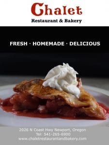
I decided to advertise their pies and keep it very simple. I am very keen on the simplicity of the ad as I got taught that from my Deep Cove ad. I was inspired from an ad I saw on Facebook and once I had an idea I started putting everything together.
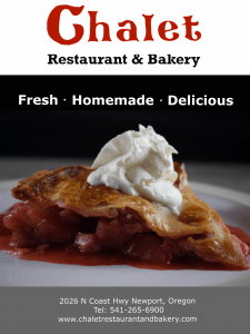
However, I did not have any pictures of their pieces of pie to put in my ad and I didn’t want to use copyrighted pictures. I tried contacting Chalet for a pictures of their pie but they did not respond in time so I took the responsibility into my own hands. My solution was to bake a pie from their menu for my ad and use that photo. I took a photo using my mom’s camera and mini studio for the perfect lighting. I added whip cream to finish the picture off.
Now with the pie photo I started constructing my ad. I also did not have a clear picture of the chalet logo so I drew and traced the chalet logo on keynote. In this ad I decided to have the logo centred rather than off to the left. I decided to have the pie and slogan (Fresh, Homemade, Delicious) just below the logo. I made a grey box section at the bottom with the business information in it.
Our ads got critiqued by our peers, teacher and older PLP students. I then used this feedback to make my ad better and more appealing to the eye. The first things I changed between draft one and two were making the Chalet logo and slogan bigger. I also changed the ad so there was less black above pie photo, more of pie showing and a different colour rectangle at the bottom.
The features I changed between the second and third draft were that I once again made the logo and slogan even bigger. I also made the bottom box smaller and a lighter shade of grey. The things I altered from the third to fourth draft were subtle but I think put the ad over the top. I added a gradient colour change in between the black box and the header so as to not make the box such a sudden change. I changed the font of the “Restaurant & Bakery” as it was cut off and I stretched the slogan horizontally as I thought it looked better.
Overall I think my final ad draft looked even more professional as my drafts went on. I think there is always room to improve and if I had more feedback I would make my ad even better. However, this project was not just about changing the little things and by my draft four I was given feedback that I could stop making new drafts as I would not learn anything more.


Leave a Reply