Hey guys it’s Ben and this post is a reflection of my Deep Cove ads.
Our first major project in PLP was to make an ad for a Deep Cove business. The project lasted about a month, starting on September 15th and ending about a week ago. We had to make an ad and then the rest of the class would criticize it and give us tips to improve it. We did that process about 4 to 5 times. It really showed how demanding making an ad can be, and how precise and perfect your ad has to be.
My group decided on making ads for Cafe Orso, a cafe down in Deep Cove. They wanted us to display their croissants, or their signature avocado toast. They wanted to give off a relaxing vibe, a place to relax after hiking Quarry Rock or to finish work. So my group, Lauren, Kaia, and Finn took some pictures and started out first ad.

My first ad draft a couple problems. First, it had no call to action. It wasn’t telling consumers to go to Cafe Orso or to do anything else. Also, the font I used for Cafe Orso was hard to read, at least to me. So I created a second ad draft.
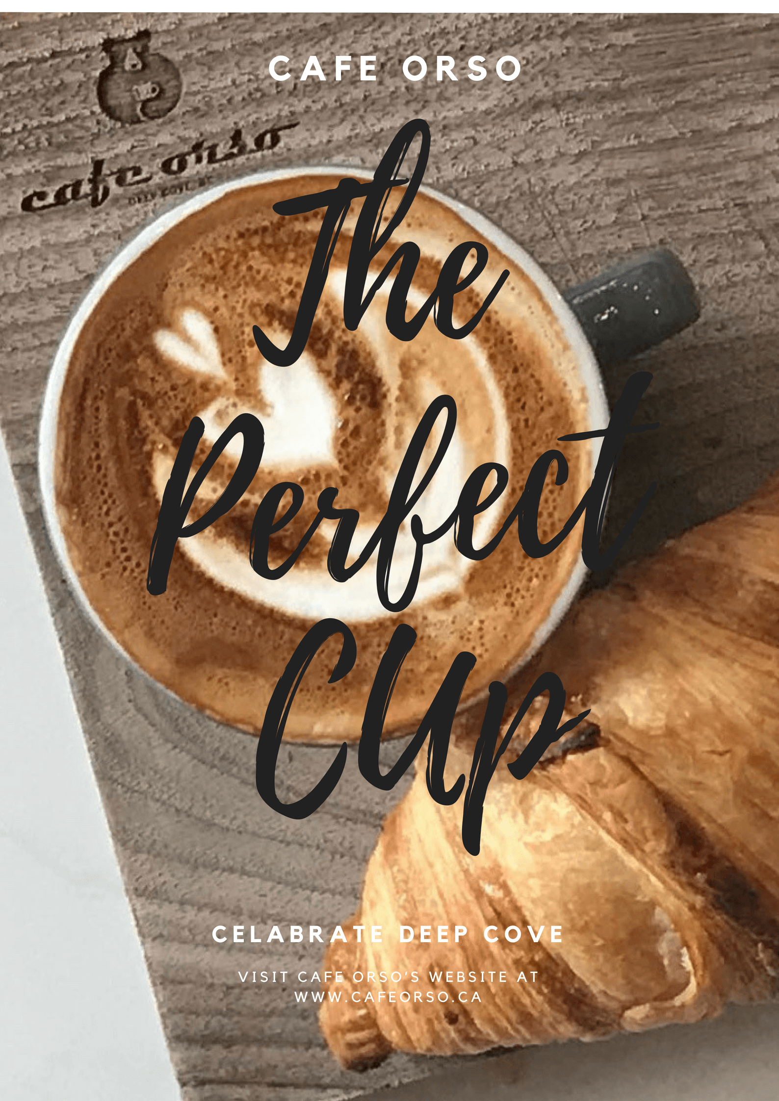
For my second ad draft I was trying to showcase their croissants, like they asked. But this ad has problems too. I still used that same font which was a mistake. Also, you can’t read the end of perfect. I couldn’t change the font to white as that wouldn’t work with the foam in the coffee cup and any other colour would look weird. So ad draft three came along.

This wasn’t actually my third ad draft but I was expecting it to be. But I talked to my teacher, Ms. Willemse, and she said that I was losing the actual company itself. She said the ad was advertising Deep Cove, not Cafe Orso. I still used that font too, although it is easier to read here, at least for me. But I couldn’t hand this in after what Ms. Willemse said so I had to make a new ad.

I think I could have used this ad for my final draft. But it still got its fair share of problems. The font is easier to read even though I kept that font, (looking back I don’t know why I stuck with that font for so long). It has a logo and information about the company. But it still wasn’t perfect so I had to make a fourth ad.
Between my third and fourth ad my class went to Pound and Grain, an advertising company in Vancouver. At Pound and Grain my group learned a lot. We learned that colours play a factor in advertising. A colour like yellow could give off a happy or energetic vibe, while blue portrays relaxing or sadness. Since Cafe Orso wanted a relaxing vibe I tried to use blue in my next ad. We also learned that ads should be simple, unique, and include pathos, ethos, or logos. With this new knowledge I created my final ad.

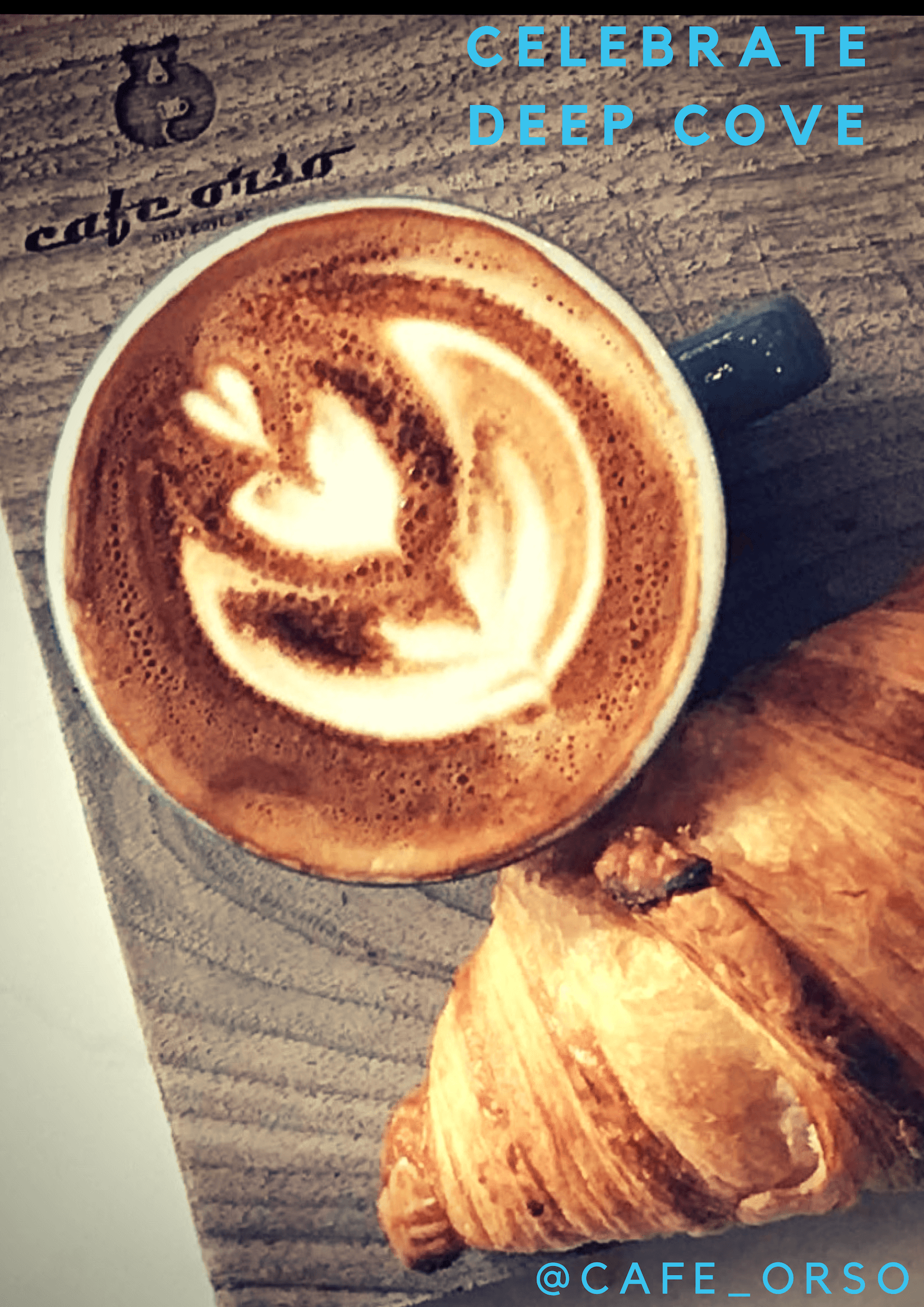
This is my final ad. It’s simple, (it has no crazy font in the middle), a call to action(Celebrate Deep Cove), it showcases Cafe Orso’s croissants, it has company info, and notice how the font is blue. I tried to take the stuff I learned from Pound and Grain and put it into this ad. I think I succeeded.
- My First Ad Draft
Anyways, I think I learned a lot from this project. Like I said at the start, creating ads is a demanding process, with a vigourous drive for perfection. We recently went to Oregon and my new group is making an ad for an American company so keep a look out for a new post on that. Thank you for reaching the bottom of my post and be on the lookout for that Oregon post. See you later!
I think your final ad really balanced making the Cafe the focus with bringing in the desire people have with connecting with place (“Celebrate Deep Cove” – Pathos right?). This makes the Cafe stand out from other places.