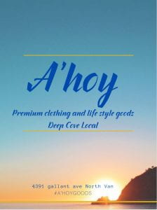
We had to design ads for companies. My company was A’hoy in Deep Cove.
This project was really cool because I learned how to use Canva to design an ad. It’s my first time ever designing an ad. It was fun seeing how much change I could make to my ad and how I could make it better.
I knew that I was going to share it with my group and see their ads too. I wasn’t really looking forward to sharing with other people because they might not like it. But it turned out to be really fun.
1st draft
On my first draft I decided to put a font that kind of looks like the one A’hoy uses and I put a picture in the background that fit into the idea of A’hoy – because it reminds me of a nice water setting like Deep Cove. It looks good in the background.
I used the work we had done in class on placement and colouring and spacing to play around with the ad and fonts until it looked good.
2nd draft
In my second draft I didn’t really change that much, all I changed was that I changed the size of the text on the bottom of the poster and I moved the picture in the background a little bit.
I made the changes because I was told during our group work that the text on the bottom was too hard to read. In the group, I also commented on other peoples’ work – we noticed that someone else in the group had text that was too hard to read and they changed that. I think we all learned from the feedback.
3rd draft
On my 3rd draft I changed my background picture to one of Deep Cove and I changed the colour of the text to the one that A’hoy uses ( from dark blue to very dark blue).
I haven’t got feedback on this yet. I’m looking forward to that.
I learned a lot about how to make my ad better by discussing it, seeing other peoples ads, and looking at historical ads. I still think that there is more for me to learn about making an ad.


