Wow I can’t believe that it is already almost the end of this quarter. Time has flown by since the beginning of this new project we started. In PLP we always start the project with a driving question. Our driving question was “How does what we hear, read, and see, influence us?”. My first reaction to hearing that was “Oh it’s probably going to be something about media and advertising.” And I was right.
As per usual, we kicked off the project with the Launch. We were told that throughout this project, we would have 4 separate teams to work on things with. The teams were North – our main project group, East – design/photo group, South – analysis group, and we had our West group – advertising. One of the first things we do in a project is develop our ‘need to knows’. For this, we were in our north groups because these are the people we will be spending the most time with on the actual project. We had a whiteboard-sheet-thingy and our group had to sort the NTKs into three categories:
Product – What will we make to share our learning?
Process – How are we learning? How are we gaining new knowledge? and
Content – What are we learning?
We would be coming back time and time again to this sheet to add more questions and park the questions that we already answered.
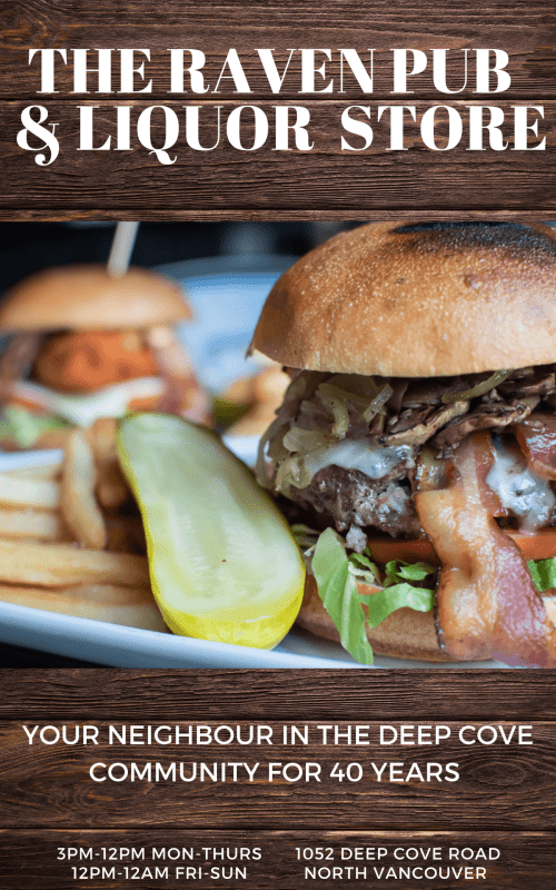
Each north group got to choose a local business establishment to create an advertisement for. My north group chose to do The Raven Pub & Liquor store. We contacted them via email with some questions about their business to help us when we create the advertisements. We got a reply back with answers so we were ready to start preparing for our drafts. We learned about what makes a persuasive ad, layout and composition, advertising techniques and appeals, images and copy. The first drafts were made that night and then we went back to school the next day and continued to learn more about how to make a professional ad. We would get time to share our drafts with our north group to receive feedback and critique to then go make another draft. At this point I have now made 4 advertisement drafts.
Draft 1 ⬆️ – This was my first advertisement draft. I did NOT like how it turned out. I didn’t like how the ravens feet were lost in the title, I didn’t like the layout, the text was all mismatched, it just wasn’t working for me.
Draft 2 ⬆️ – I tried to change it up a bit from the first draft by adding a actual photo from the raven. I also changed the copy.
Draft 3 ⬆️ – After lots of peer feedback I rearranged the text boxes and yet again Changed the copy text.
Draft 4 ⬆️ – I wanted to try to do something completely different with this draft and I think it paid off. I chose a completely different layout and background. This is by far my favourite draft because I love the minimalistic tone to it while still representing the rustic raven. I wish I had made more of the text match though. (Definitely will do that for my next revision.)
It has been especially cool to relate this projects learnings to my everyday life. I can now look at ads and try to gain further knowledge of how they are influencing me and what techniques they are using. I can think questions like: Does this ad use pathos, ethos, or logos? What is the message this ad is trying to send? Who is the target audience? Am I the target audience?
Anyways thank you for reading my post and I hope you enjoyed!
As always, Brooke.


