MPOLS or SLC

Being in PLP we have to do two SCL’s (student lead conferences) a year. Because I am in Gr.8 this year this is my first one. A SLC presentation is about 12 minutes long. 7 of those minutes are for me the student to talk all about the stuff I’ve learned this year and what to do better for the rest. The other 5 are for the parents and the teachers to ask me questions about my work, learning, and presentation.

What I did great

My favourite thing we’ve done all year is the religion unit because religion has always been one of those things that where your curious about it but you don’t know where to start because their are some many differ religions. Another reason I loved that unit is because we got really good critique from my classmates, Ms. Willemese, and some advice from Mr. Hughes.

To read the entire worldview and religion post click here.

Another one of the things I’m proud of is the Star Wars exhibition. Although it was a lot more in-depth than any of the other projects that we have done so far I really liked it after it was over, because while it was going on I was stressed like crazy. But I was ready for the day of the presentation and one of the biggest things I learned is that procrastination is not good at all.

The frustrating work

There was only a couple of the big things that got me frustrated so far this year. One was the advertising unit because I kept rushing through each draft and ended up having to do 18 different drafts. Now because of that learning experience I learned that speed isn’t always the best, and that I should slow down when doing assignments because I might miss something or come up with an even better idea.

Some of the ad drafts that I did.

The other was the door is a bore project in math. It was really fun but really frustrating because we didn’t check each other’s calculations so we end up almost having to restart after 2 weeks of hard work. But we used our problem solving skills as well as some help from Ms. Klausen to figure out a solution. To read the full story click here.

The bad stuff

The worst piece of work that I have done this year was probably the growth mindset unit in maker. The reason I think this is because I procrastinated a lot of the work in that unit, mostly because it was the start of the year and because I over estimated my abilities.

Myself as a learner

Now reflecting back on the year so far and the rest of the year to come I have a bunch of things that I’m going to change and somethings that I’m going to keep. A couple of things that are going to change are I’m not going to procrastinate every thing I’m going to get everything I need to get done done before it gets to late. Another thing I’m going to change is I’m not going to over estimate my abilities. Some things that I am not changing are reading, staying in PLP.

Thats all for this post till next bye😀😀

My door is a bore no more!!

So this post is a little different than the other posts. This one is about math!! Now this is the first blog post about math but it’ll still be great. So here we go.

The start of the first project we did in math was a lot of what we did in humanities. But first the project, to turn increase the door belows surface area by five using shapes.


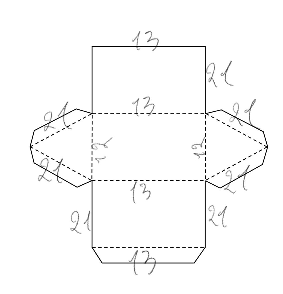
After we got the assignment we were divided into groups of four my group was composed of Jordyn, Paisley, and Luciano. Our first step was to do our calculations on how much surface area we needed and what shape we needed to make. After making a ton of calculations we decided to go with a triangular prism with the dimensions of, height of 40 cm, length/depth of 26 cm, and width of 24 cm. But then disaster struck, the paper wasn’t big enough for our measurements. Then we got an idea. We could just half the measurements and double the amount of shapes we would make. So instead of 6 shapes we made 12 that looked like this.

But then after spending 320 minutes making them we taped them to the door and found out the our calculations were way off!!!!!!! 😭😭😭. So then it was time to put our problem solving skills to the test. We were just under half way to the surface area that we needed to achieve. Then we had a brilliant idea 💡 we could open up the tops of the shapes and that would double our surface area. So we did but we were still short about 90 cm2 so we made a little cube to go on as well.

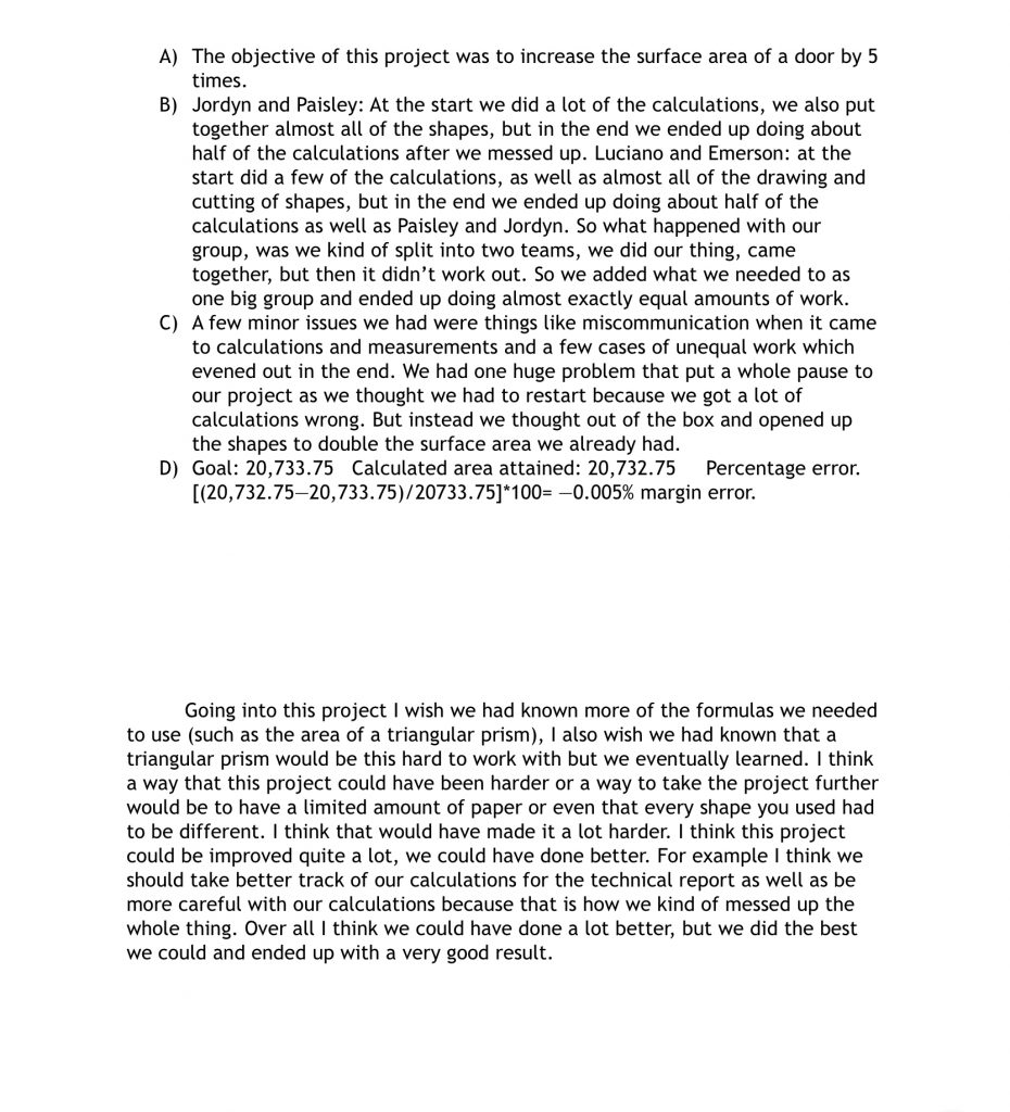
After you do a building task you have to write a technical report on everything that you did and what you would do differently. So my groups is right here.

Now if you read it says that are percentage error was -0.005% which means we went over by 0.005. The reason why is because the side lengths of the cube was some how changed by 1 more then it was suppose to be and the error was so small it doesn’t really matter.

The final door with all the shapes from all the groups was quite spectacular, as it had all different colours and shapes.

Refection time 😀

Now after doing the entire project I have increased my understanding of shapes and surface area. One of the key things I learned is that never let just one person do the calculations and just agree with it, because if we had checked our calculations before we started making the shapes we would of known that our calculations were off.

So that’s all for this blog post hope you have great rest of your day and thanks for stopping by to read this.

A religious worldview

Just before the break ended we were studying religion and worldview in humanities.

Now if you are reading this as a religious person please don’t feel offended if the information is incorrect because I only really focused on the Muslims so please don’t get mad.

So now onto the interesting part. We started of with us being put into groups of four. My group was composed of Sam, Gabby, and Fraser. Then we learned one very key vocabulary word for this unit. Worldview- a particular philosophy of life or conception of the world. It can then be divided into seven main categories geography, knowledge, economy, values, society, beliefs, and time.

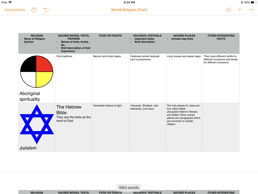
Once we had that all down we went into the religion part. First we were tasked with making a world religion chart about all the religions.

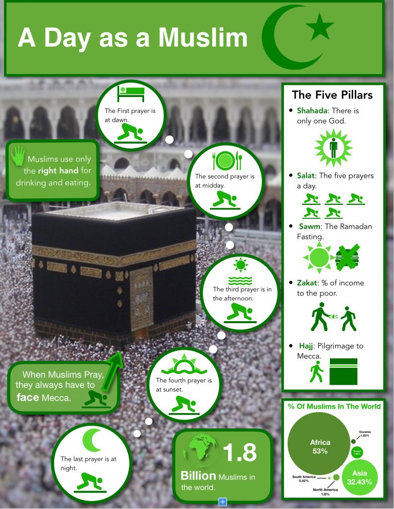
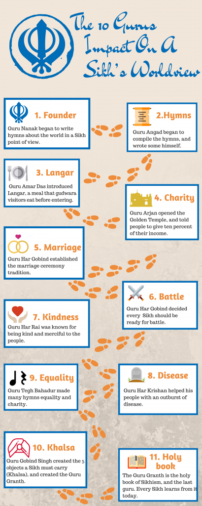
While that was going on we also had to create infographics about a specific religion the groups were Christianity, Islam, Jewdism, Buddhism, and Sikhism. My group had rotten luck and got the muslims. Now wait I am not saying that the Muslims are bad, the reason is because we had to ask an Imam questions 2 days after we got the assignment.

So that was the next part we went to the each of the religions gathering places and each group had to interview the leader to understand more about that religions worldview. So now we have a script that we were going to follow but of course I messed up and we had to scrap it. But I’ll still put it in because why not.

So then we started focusing on our infographic. As well as going on 4 other field trips to see the other religions.

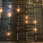
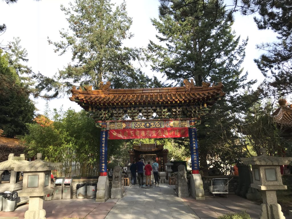
The mosque

The synagogue

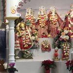
The Hindu temple

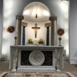
The Christian church

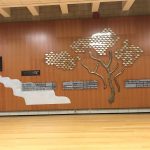
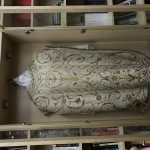
The Buddhist monks

The Sikh gurdwara

Then my group of Gabby, Fraser, and Sam stared focusing on the infographic.

This was our first draft that we made. It was made in keynote don’t know why but that’s why it’s sideways. So its really bad but its a first draft so don’t judge.

So now we changed to pages and changed a lot of stuff. The background the colour and icons are all new from the last draft.

So this is our third draft and all we did was change one colour.

At last we came out with this amazing beauty. It’s easy to read and understandable. We changed the  flow of the page. And added lots of icons plus some fun facts.

Now we had groups for all the religions we study except Hinduism sorry but here are their info graphics.

Thanks for reading

-Emerson

An exhilarating exhibition


Hello dear readers I’m back with another blog post and this one is about the Star Wars galaxy. So every year PLP has two exhibitions. One in December and one at the end of the year in June. So being in grade 8 this was my first exhibition. Every exhibition there is a new topic, as you might of guessed this one was Star Wars.

So as it turns out there is a tested step by step process to follow when making these exhibits. It is called the inquiry star.

The star is a very easy way to understand the process that you must go through to come up with an amazing exhibit. So here we go.

The first thing we did was learn more about exhibitions because we had never done them before. After we knew all there was we started making a list of open ended questions that we had about Star Wars.

Here are all the questions that I came up with. The next step was to narrow it down to the three that we liked the best. My three favourites were numbers 3,4,and 7. Then we had to submit our three favourites into Showbie. As you can probably tell right now it was a very gruelling process. Anyways the next step in this part was to get feedback from our teachers. Ms. Maxwell my teacher said that number three was the closest one to what they wanted. My final question was, What aspects of the force are nature and what are nurture?

The final step was to fill out a project pitch form. What it was, was a bunch of questions that we had to answer.

So this was my project pitch. The reason why it wasn’t filled out all the way is because I didn’t really know what we were doing just yet.

The next step was to investigate my question. To do this I researched the long standing argument about nature vs nurture and I learned that it’s not just nature or nurture, its really nature and nurture.

As you can see here I found a ted talk on nature vs nurture and it gave milk for its example.

Now it was time for construction. To start this step we had to fill out a what do they see sheet which was basically what someone would see the day of the exhibition.

So this is my exhibition construction and from there we went right into building our project for the exhibition.

Now me being a procrastinator I left it to the night before which was the worst idea I ever had. So three days before the exhibition when we were supposed to bring in our projects for a critique my project looked like….

I know, I know it’s possibly the worst piece of work I’ve ever done but lucky for me it was not the day of the exhibition because if it had been Mrs Willemse and Ms. Maxwell would not have let me present my project. Good thing this was a critique because I needed to make drastic improvements to my project.

So the main critique I got was to much white space. Which I already knew but it was still great critique.

Now for the makeover I had less then 72 hours to turn this train wreck into a  presentable project. So I basically learned nothing from earlier and I pretty much left everything to the last night again but it was ok because I already had a solid image of what it was going to look like. As well as I already had most of the information I needed.

Now on top of all of that we also had to decorate the rooms that we were using to fit the Star Wars theme and just to make things ever harder we also had to wear costumes that we had to make and guess what they had to be Star Wars themed as well.

So it was Alivia’s idea to do famous skits from the Star Wars saga every fifteen minutes so a lot of our costumes were chosen of who was acting in what skit and who the skit involved. So I decide to be Chirrut Imwe from Rogue One and Emily dressed up as Jin Erso so we decided to re-enact the scence when they first meet in the busy market.

So the night before as well as finishing my project I was also putting together my costume and of course Chirrut is not complete with out his staff so I also had to make that as well.

Now you might be wondering how I made the staff. What I did was I took a broomstick handle and wrapped it in brown duct tape and then to make the bumps on it to make it more realistic I put small balls of masking tape on the stick and then taped over it to make it more stick like.

Focusing back in on the project the deadline was getting closer and I still didn’t have a fully completed project so I had to work fast. The first thing I did was add pictures to the poster to fill up some of the white space then I redid the title so it was easier to read. Next I did some more research and added some new parts that I think really added depth to the project. So on the day of the exhibition my completed project looked like this…

So as you can see drastic improvements to everything. So what I did was I compared Anakin to Luke and then Luke to his actor Mark Hamill. I also add a bunch of photos to fill up the white space and re did the title so it looked a lot better.

Now earlier in the post I mention that we also had  to decorate the room that we were presenting in.

So we decided to turn the room into the rebel base on Hoth as we were the light side and I believe that we did a pretty good job of that.

Now its time for the one thing that never changes in each post my reflection on the unit.

The first thing I can tell you right of the bat is that I HAVE to work on not procrastinating everything to the last minute. One thing that I think I did really well was the presentation it self I believe I excelled at that part of the project. Something I was surprised about was how stressful it can get. I mean, I don’t get stressed out easily so when something gets stressful its got to be stressful. Now I’m excited to do my next exhibition which in June because now I know what it’s like and I probably won’t get as freaked out as this time.

Thanks for reading                                                                                                      -Emerson

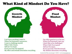
The Power Of A Growth Mindset!!!!

In PLP 8 the first thing you learn about is growth mindset and how to change and effect it.

We started of by watching a video of Timo the cat. Which shows how much perseverance it takes to achieve something, even if it’s getting into a hammock. Then we took a Grit and effort quiz to see how gritty we were. I got 2.60 out of 5. So I’m not very gritty yet but it said that I have a growth mindset so I can always improve.

Now some of you readers might think you are either born with a growth mindset of not, BUT that’s not true. Many scientists have done research which shows that the brain is like a muscle it can grow and improve too. So it doesn’t matter your who you are or what you like you can always develop a growth mindset.

So to go along with this growth mindset unit we had to do a long term goal selfie project. To do this we had to do a couple things first. First we had to do a mind web of all the academic stuff we wanted to improve using MindNode mine was not very big but it had every thing in it.

Mind Map

So after we did the mind map Mrs Maxwell our Maker teacher taught us about S.M.A.R.T. goal achieving.

After that we were ready.

So my first draft (yes there will be a lot of drafts on this portfolio)was very good. To be honest I wasn’t sure I was even going to get in on time. But here it is the original photo that I used.

Then I darken the background and cropped the photo so it looked like this.

See much better so then I added the words for my goal.

So obviously I need to change the text colour so leave comment down below if you know a good colour to go with my background.

Thanks for reading,

Your truly Emerson.

An Amazing Advertisement

In Humanities we started of with an advertising unit. To start we were put into groups of four and were told to call a business in Deep Cove and ask if we could meet with them to discuss designing an ad for them. My group (Kyle, Lucy, Taylor and me) were lucky. The first business we called which was the Cove Creek Gallery said yes. After we interviewed them we went to work designing our ads.


This was my first draft. After Mrs Willemse grilling almost everyone’s ads we started draft #2. Some of the critique I got was the background was plain and the visual elements were confusing. So taking all that into consideration I came up with this.

ad draft 2.0

As you can see the ad has changed dramatically. I tried going with a different approach but it didn’t turn out the way I expected. So it was back to the drawing board for the ad.

But right around the time of our third and final ad draft we were introduced to comic life 3 an app for making comics. So my third draft looked like this.

Draft 3

So you can see vast improvement. But enough of local businesses it was time to step it up. On our Oregon field trip one of our assignments was to interview a Oregon business and design ads for that place. We stayed with the same groups, so my group pulled Hatfield Marine Science Center as our business to interview. The person we interviewed  name was Athena and she was so nice. She answer all our questions and gave us good advice on what to change about our pre designed ads. Oh yeah I forgot to show you reader it. Here it is

Ad draft 1 Oregon

As you can see its not bad at all its not even close to being do but for a first draft it good. But she gave me some great feed back. Athena said to change the background colour to orange to match their logo. Also to mention that its located behind the Oregon State University. So here’s ad draft 2 for Oregon.


Oregon draft 2

So it’s definitely better but in case you were wondering the background isn’t orange because all the orange colours were to bright or didn’t go with the ad at all.  So we got some more critique from Mrs. Willemse. Some feedback I got was there was too much white in my ad so I had to fix that and that the behind Oregon State University whould be gone and to take away the word at. So here’s draft 3

Oregon ad draft 3

So there is definitely less white and the spellings fixed. But I still had a bunch to do.

This was my final ad draft after a ton of improvements I came out with this amazing ad.

So that’s it after a ton of revision and improvements the ad was final done. Now reflecting back I would payed more attention to the small little details so that I didn’t have to make any more drafts.

Thank you reader for reading all of this post see you again.