The goal for this project is make an advertisement for a Deep Cove business and to answer the question How does what we hear, read and see influence us?
🚀 Launch
For this project we were assigned to four different groups. North = main project group, East = design/photo group, South = analysis group, West = advertising group. My North group included: Claire, Cooper, Kwosen and Jocelyn.
First we wrote all our Need To Knows (NTKs) about this project on sticky notes and organized them into three sections: Product, process and content.
✅ Milestone 1
For this milestone we watched a really cool video called Welcome Home. It is an ad made by Apple to sell their HomePod.
We were assigned the task of typing a paragraph explaining the target audience, the message of the Welcome Home ad and how the message was delivered to the target audience. I found this Milestone slightly difficult because I was new to explaining and answering the topics above. I also forgot a conclusion and supporting arguments, but the great thing is that in PLP if you make a mistake or didn’t reach the ☀️ emoji
you can revise your work and get a better grade. After revising the paragraph I got a 🌈 emoji. I learned from this mistake that it is important to check the assignment rubric before submitting the assignment.
Then we brainstormed Deep Cove businesses to advertise for. Our group decided on Covert Neighbourhood Cafe. I didn’t know what businesses there are in Deep Cove because I don’t live in the neighbourhood and haven’t spent much time there. So the decision was mostly up to rest of my group.
💡Building Knowledge
In this phase we built our knowledge on several topics including: photography, advertisement techniques and appeals, and historical perspective.
First we practiced and built on some new (and previously gained) photography skills. We learned about angles, views, saturation, brightness, framing, leading lines, etc. I found this fairly easy as I already knew most of the things listed above from a movie making program I participated in (click here to see the movie I made).
⬇️ Here are some of the photos my East group and I took ⬇️
 A panorama we took just for fun!
Then we learned about the five core concepts and questions for advertisements,
then practiced finding them by analyzing an ad.

Next we learned about historical perspective.

Using historical perspective, if you were in the time of this ad you would not be surprised by it, because women had less rights and respect then they have now. You would be shocked if you saw this ad in the newspaper today.
✅ Milestone 2
This milestone was almost exactly the same as milestone 1. The only difference was that before the paragraph we answered the five key questions of media literacy. I found this milestone easier than milestone 1 because I had more practice and knowledge to answer the questions and write the paragraph.
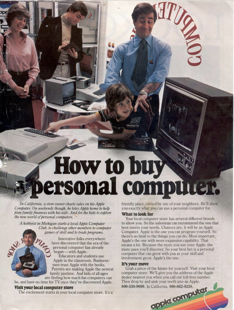
⬇️ Here is the ad I chose to analyze ⬇️

Then we did an advertising survey. We had to fill out the questions for ourselves and then fill them out for someone older than us (it couldn’t be anyone in our class).
⬇️ Here is the survey ⬇️

I was not that surprised that my mom and I had mostly the same answers. We both don’t like to pay attention to ads.
Then we learned about advertising techniques and appeals. These are two important things that ad designers use in their advertisements to lure you into buying their client’s products. Then to practice identifying the techniques and appeals we had to watch half an hour of TV and fill out a chart.
⬇️ Here is the chart that I filled out ⬇️

I found this difficult because 1) I don’t really watch TV, I prefer reading, and 2) The commercials went so fast that I didn’t have time to fill out the questions before the next one started playing.
Next we got to learn about three Greek words: Pathos, Ethos and Logos. Pathos is when advertisements are designed to pull on your heart strings or trigger your emotions. Ethos is using credibility, usually using celebrities or well know and trusted people (like doctors). Logos appeals to logic using statistics and percents and scientific proof (for example “our smoothies contain 75 essential vitamins”). ⬇️ Here is an ad with pathos and logos in it ⬇️

We also learned about the Herd Theory. The Herd Theory is when ads use a group of people to convince more people to do the same thing. For example and ad might show a bunch of well know teenaged TikTok stars vaping. When other teens see the ad they think “Oh! If they’re vaping, then to be cool like them I need to vape too.”
✅ Milestone 3
For this milestone we had to write another paragraph that included the message, techniques and persuasion appeals, the target audience and how the message would impact them. We also had to use past and present perspective and then compare the difference in values in them. At first my paragraph was really long and had lots of repeats. After getting some feedback from my mom I shortened it to about half the length. I learned that to write a paragraph like this it is very helpful to type out the main points in bullet form, then write those points into sentences.
⬇️ Here is the ad I chose to analyze ⬇️

🔁 Develop and Critique
Over the duration of this project we had a shared Numbers document. In this document we had things like phone scripts, question brainstorming, photos, ad drafts, contact information, etc. I found this very helpful to be able to make all of our drafts and information available to everyone in the group. It was very frustrating when other group members deleted or moved content.
Before we could start working on advertisements we needed to answer some questions. So we had a phone interview with Paul, the owner of Covert Cafe.
From the information we gained from the interview we were able to start making ad drafts. Paul wanted us to advertise their cinnamon buns and coffee. We used the app Canva to make our ads using a colour pallet of blue, brown and white, because those were the colours that Covert Cafe already uses.
I tried l multiple different styles and images for my ad drafts.
⬇️ Here are my two first drafts ⬇️
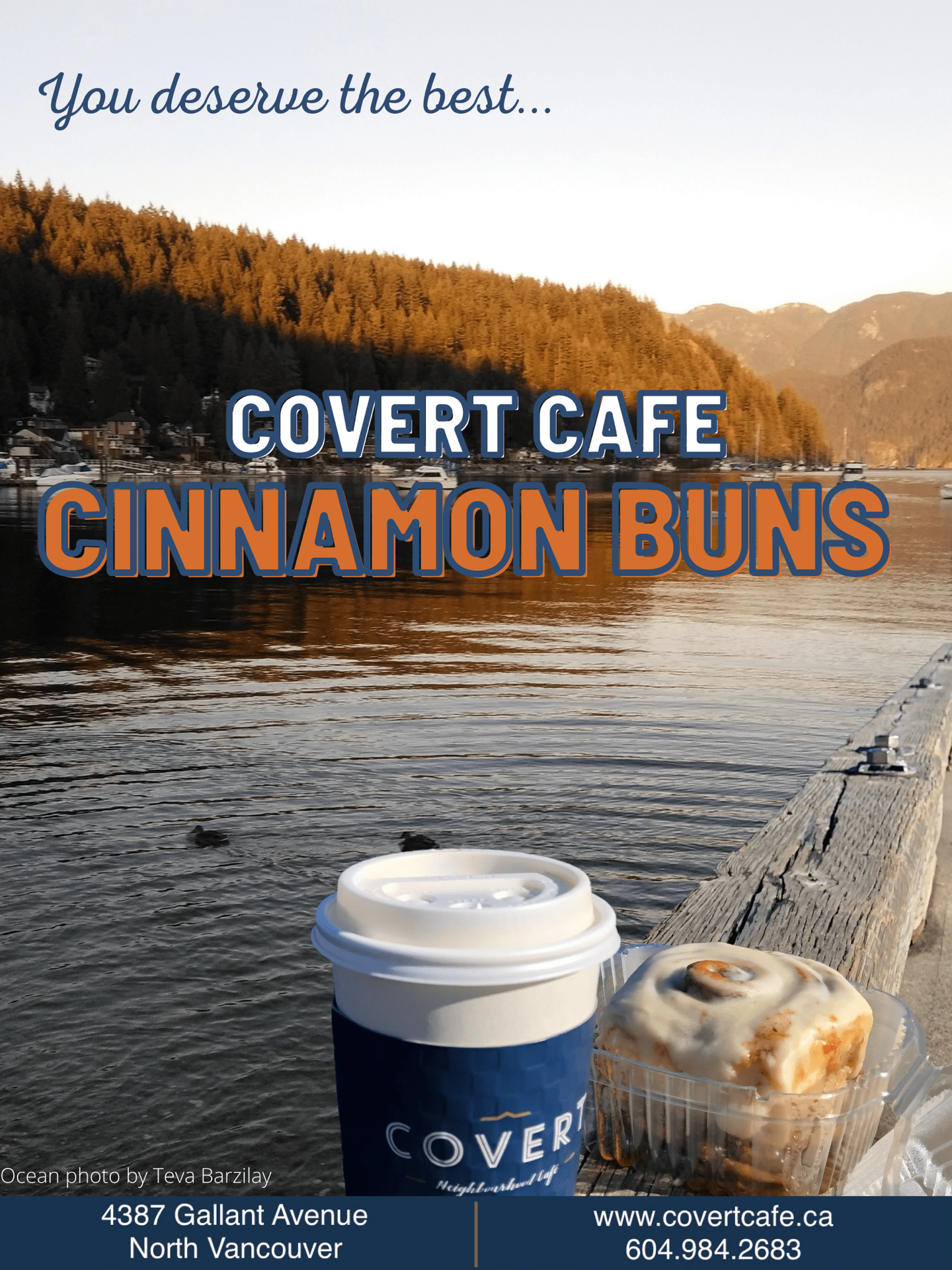
Then after my classmates’ critique and Mr. Hughes’s harsh, but helpful, critique I fixed the horizon line that used to be on an angle, added a bunch of porthole photos, got a different picture of Deep Cove ocean at sunset from my friend and classmate Teva to make it less blue, and changed the wording. ⬇️ Here are my three second drafts ⬇️
After some critique from my family, and after thinking about it more, I made a fourth draft with Teva’s photo with the dock edited in. I also changed the copy colour so it would contrast and stand out more and changed the font and position of the “you deserve the best.” ⬇️ Here is my final individual draft ⬇️
I found most of the critique I got very helpful, and I hope that my critique for others was the same quality. ⬇️ Here are all of my individual ad drafts ⬇️
We also were supposed to take pictures of every ad we saw during this project. Every week we added another ad to a table then filled out some questions about the ad. I found it hard to remember to pay attention and take pictures of the ads because I usually try to block them out.
Throughout this project we read a book called “The Gospel According To Larry” by Janet Tashjian. It is about a teenaged boy who… never mind, I don’t want to spoil it, because I highly recommend that you read it! After every two sections we filled out a power sheet with questions, important passages, etc.
I really enjoyed this book, it has a very intriguing plot and it is very well written. I will definitely be getting the last two books in the trilogy!
Click here to visit the final summative post for this project.
We have about a week and then this project will be done, and so will quarter one… next up Scimatics! Keep your eye out for a new post about the end of this project and more about the answer to our driving question coming soon. Make sure to check out the other blogs mentioned in this post: Claire, Cooper, Kwosen, Jocelyn and Teva.


