Well, that was a lot harder then last time.
As you may know, we started a new project called “The Medium is the Message.” I even wrote a blog post about it already so… you should go read that if you haven’t. Anyways we are just about wrapping up this project, so let me tell you about all the stuff that I forgot to mention in my previous post.
Milestone 5: The Medium is the Message.
So who knew that one of the final milestones we would have to complete, would also have to be the hardest. For this milestone we had to write another paragraph (sigh) about Marshall McLuhan. In case you didn’t know, McLuhan is a Canadian communication theorists, who became famous after writing a book about mass media and the thought and behaviour surrounding it. The paragraph we had to write had to be about the connections between “The Gospel according to Larry, and a text called “McLuhan for beginners”. Now the problem is that “McLuhan for beginners” is a text meant for grade 12’s and 11’s, meaning it was a bit complicated for my small little grade 8 brain. Just listen to this, “So, the contained medium becomes the message of the containing one!” I mean out of context that sentence is almost impossible to decipher. Even when you have the context (like I did) I still could not understand what that sentence means. I still don’t even know what it means after I finished the entire project. I managed to eventually finish the paragraph, even though it took an entire day to complete. Even though the text still makes almost no sense, I think I still took away some valuable information on the topic.

Bluhouse:
Now I haven’t actually told you about our business. We chose Bluhouse because we thought it was a nice local cafe that could use some help with advertising. We ended up sending an email to them to get more information on what they wanted to advertise. They responded saying that they wanted us to focus on their Online Grocery Delivery service, so that’s what we did. Our contact was pretty limited with our business. We sent them a couple of more emails for feedback on our drafts, but that was about the level of communication that we got. For the most mart we were on our own.
Food Photography: Part 1.
Some of the most fun I had on this project was doing food photography for my ad, so let me talk about that. (quick disclaimer, I did virtually no research about how to do food photography, this is just about my experience with it.) One rule that everybody had to follow when making their ads, was you had to use your own photo. So for my individual draft 3, I decided to try to take some of my own pictures. Here’s what I ended up with.
Now to answer a few of your questions
- I chose blueberries because they were the only fruit I had in my fridge at the time. (they were delicious btw.)
- I shot the photos outside because I heard that more light makes food look better. I thought that outside was the most light I could get.
- Here was my set up.
- Yes I did shoot these on my iPad.
- No I didn’t actually have enough blueberries to fill up that bowl. I had to put a upside down ramekin underneath the blueberries to make it seem like I had more then I actually did.
- Yes, I did try to sprinkle water on them to make it look more fresh.
Now I think these picture turned out quite well. I think If I were to try this again, I would shoot it indoors rather then outdoors. I also would have changed the background because the cloth just didn’t look good with all the wrinkles in it.
Team Drafts.
In my previous blog post I talked all about my individual drafts. However those were more for brain storming and practice then actually final drafts. However, before we started the team drafts I decided to make one more completely new individual draft. This draft actually turned out so well, that my team decided that we should use it as our starting point for our team drafts.
Draft 1.
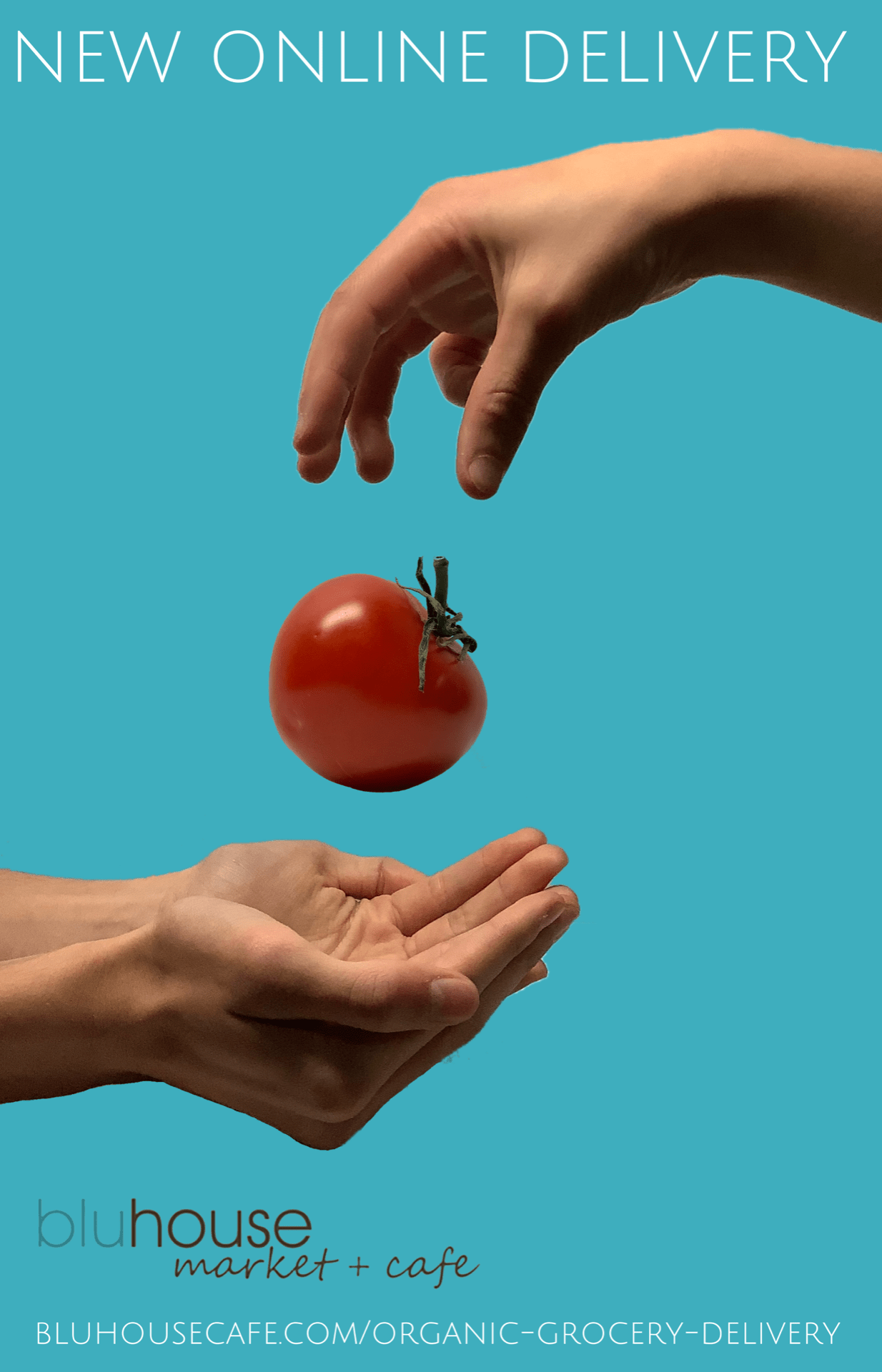
The basic idea of this draft was to show the “Organic Grocery Delivery” in the form of one hand dropping food to another. Our business also wanted us to use a specific colour (which I used for the background) and a specific font (which I could not find, so I used the closest font I could find)
Draft 2.
For this draft we tried putting in more text to explain the concept more, but eventually decided it was too much and got rid of it.
Draft 3.
We tried moving around the layout a bit, and put in a QR code for easy access to the website.
Draft 4.
We changed the background so you could actually see the “blu” part of the logo. We also simplified everything and got rid of the QR code because it looked ugly.
Draft 5
We added a little TAGLINE to explain the service a little bit better.
Draft 6.
For this draft we got a professional Ad creator to critique our ads. He told us to change the layout so its 70% picture, 20% headline and, 10% other information. He also told us to add more fruits and vegetables, and to move the logo to the bottom and make it small, (because nobody likes the looks of logos.)
We made those changes and finally finished the ad and sent it out to our business. In the end I think this ad ended up looking quite well, and I think everybody in my group is quite pleased with it.
Food Photography: Part 2.
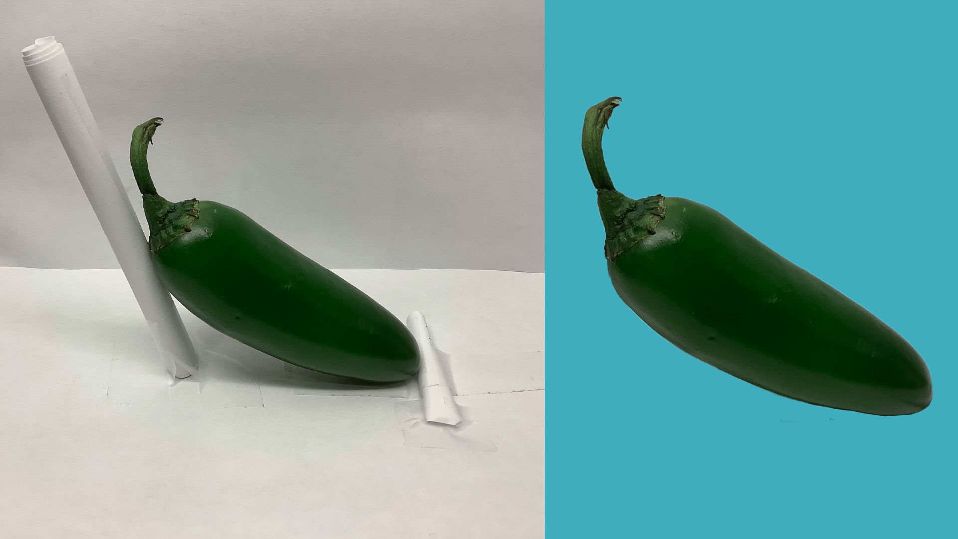
As your may have seen from those ads, there were pictures! But what you may have not seen from those ads, is how those pictures were taken.
Now to answer some more of your questions
- Yes I did take these pictures indoors. The light source was a simple light bar that shone directly above the subject.
- Yes I taped the background with paper. I did this as a makeshift green screen so I could edit out the background in post. To do this I used one of the PLP apps called SuperimposeX.
- Yes I did try dropping the tomato with the hands. Unfortunately my camera is not good enough for that and the tomato ended up just being blurry.
- Yes I did remove some of the stem from the carrot in post. It was just too big to work in the ad.
I think these pictures turned out quite well in my opinion. I think the lighting looks good, and the editing make these pictures really shine. In the end these pictures are the star of the ad, and they definitely hold their weight.
The Driving Question.
As always, this project had a driving question. That question is, drumroll please… “How does what we hear, read, see, influence us.” So Exciting.
Here are my thoughts on that.
Media influences everything. Like what McLuhan said in the “McLuhan for beginners” text, “We become what we behold.” Whatever we see, hear, or read, will have an effect on you. In Milestone 1, the Welcome Home ad showed you people dancing and moving walls. If you liked it, or even if you didn’t, It still influenced you. If you liked it, it influenced you to buy the product that they were selling. If you hated the ad, it influenced you into hating the Product more. Everything Influences us, thats what makes the advertising so powerful in our society.
Again, Thank you to Bluhouse for agreeing for this project, and thank you to my group members for making this first group project run smoothly.
If you want to see their perspectives on this project you can check them out here:


I really liked how you took the photos.👍
I really enjoyed seeing the photography stages it took to reach your final goal ( which by the way is really good )
Alicia 😄
This is an awesome reflection Nolan! You really take us through the project from the Driving Question, to your photography, to your final ad! Nice work and nice to check out your team members blogs too!