Tagged: ad

Oregon Buisness Ad Reflection

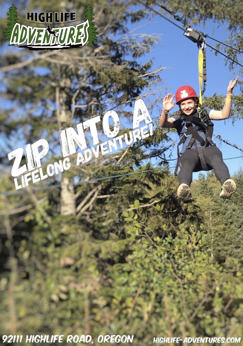
With my PLP class, we recently just went to Oregon for a field school, you can see my reflection on the trip here. Just like for the Deep Cove business ad, we were given a business that we would be visiting in Oregon and got to create an ad for that business.  The buisness that we got was Highlife Adventures which is if you don’t know, a zip lining place.  

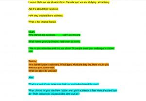
My group and I got the chance to interview the owner of highlife adventures so we could learn a little more about the company and what they would want in their ad. Here is our notes that we took during the interview:

Oregon business ad draft #1

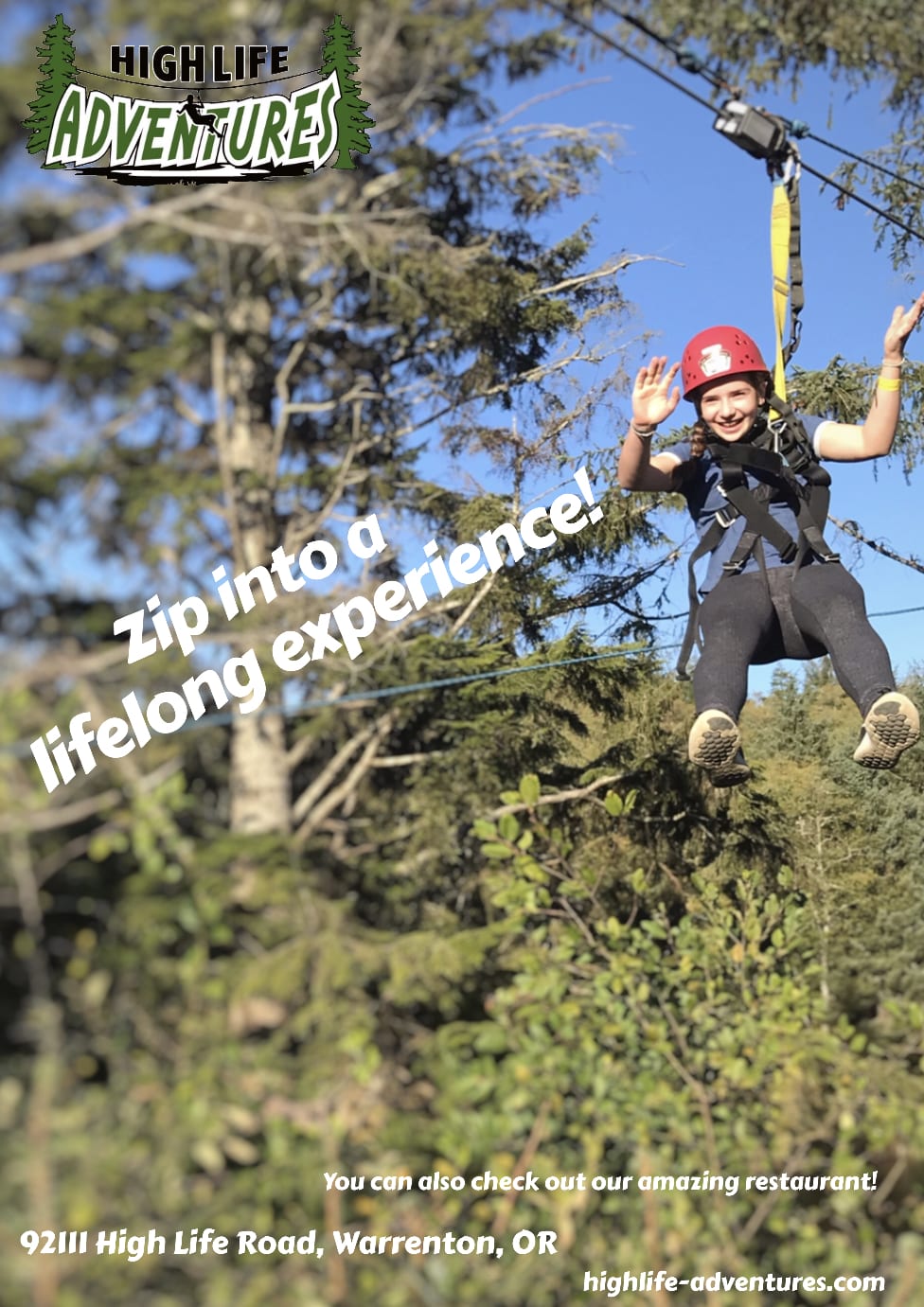
I think that this ad was pretty clean and a little professional looking. On the other hand, nothing is ever perfect at first, there is always something to improve on.  

For our first draft, it was our teacher Ms. Willemse who gave us the feed back on how to improve our ad. She told me to:

-have the “zip into a life long adventure” put into an angle 

-To move the “don’t forget to check out our restaurant” at the bottom

– To make the logo bigger and move to the top corner

– And to change the picture because it looks like one of the people in the picture are scarred. 

Oregon business ad draft #2

I think that I definitely improved on my second draft. I fixed/changed everything that I needed to and that was the feedback that Ms. Willemse gave me. 

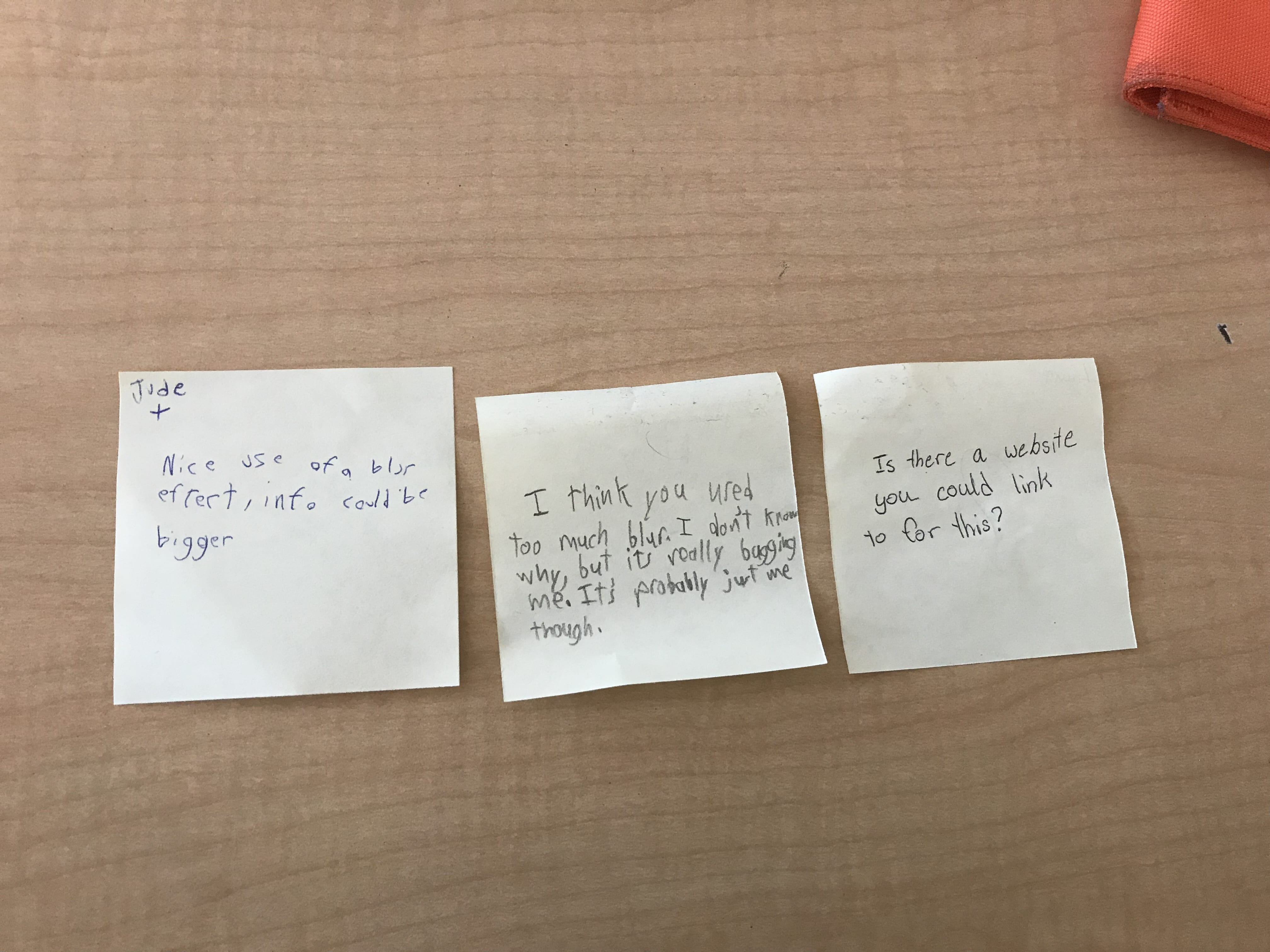
This time, we got feedback from our class mates: one that’s positive, one negative, and a question. Here are the things that I need to change:

-make info bigger

-a little less blur

-add website link

Oregon business ad draft #3

In this draft, it didn’t change that much. Even though I did make the info bigger, make it a little less blurry and ad the website link. But still, I felt like there was something that I needed to  change to make the ad “perfect”. 

Oregon business ad draft #4 (Final)

Last draft, well for this draft, we didn’t get any feed back, it was up to us! I felt that something on my ad wasn’t right. So, I experimented with sizes, places, etc. The ad still wasn’t perfect! One of my group members recommended this font app that he used and that worked really well called Typorama. Now I knew that it was perfect! Also, I removed the “also, check out our restaurant” because I thought that it was too much text. Ms. Willemse told me that I had improved a lot and that I did not need to make any more drafts! 

Conclusion 

To conclude, this was a really fun and interesting project to do. I really love that we can get the chance to be creative and be in the place of an advertiser, to experience what they do best.  

Thank you so much for reading! See you in my next blog post! 

-Lexie 😁
Deep Cove Ad Reflection


We just recently finished a project where we had to pick a local business and make a print ad for them. There is an ice cream place near our school so we decided to do that one. Here are the steps that we used to do our project. 

1. Research

After choosing a business, we did some research about the company and getting ready to interview them by gathering up some questions to ask them.  

2. Interview 

In the interview, we asked the business owner about 15 questions including: “When did you start your business?” and “How did you learn how to make the ice cream?” They told us that they wanted their ad to be simple, to somehow mention the quality of the ice cream, and to have a tagline of course.

We also had the chance to take some pictures of the ice cream for our ad. Also, my group and I (Malaika, Liam and Ryan), were very happy that they gave us all free ice cream!!

3. Ad draft #1

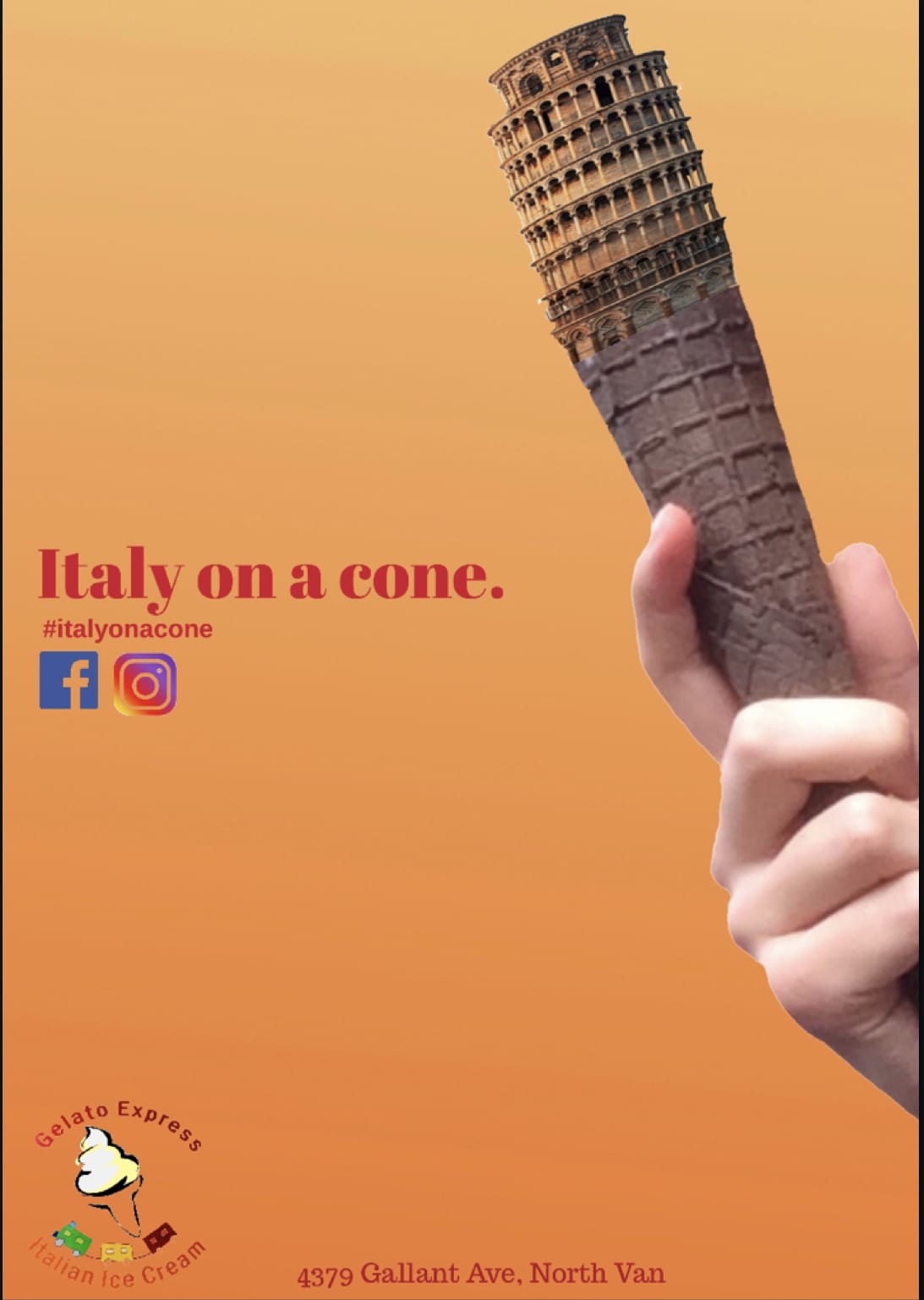
Here is my first draft, honestly, I knew it didn’t look very good. For my first draft, I  wanted to show the main idea instead of the actual quality of the ad. I included the information: made using all natural ingredients, no preservatives, etc. I also included the tagline, which really says a lot more about the ice cream than you’d think: Italy, is pretty well known for their amazing food (Atleast I think so): pasta, pizza and gelato. Which means that their Gelato is just as amazing  as the gelato in Italy except, you won’t have to travel as far.

One of the only ways that Gelato Express get costumers is from seeing it on social media, so I decided to add text that says to use a hashtag (#italyonacone) so that it could attract even more costumers. 

4. Ad draft #2

For my second draft, I decided to change the fonts and colours because they did not really go together that well with the colour of the background. I also wanted to have a  sort of “matte” background to make it look more professional. I also added some pictures of the social media apps. Finally, I added the location of the icecream shop so that they’d know where it is and where to find it. 

5. Ad draft #3

For my third draft, I decided to change the background colours because the other one didn’t match at all. Also, I made the location of the ice cream shop a little shorter since it didn’t need to be so detailed. Another change that I made was to move the logo and make it slightly bigger. Finally, took off the information because I felt like it was too much text on the ad so too focus more on the tagline and their hashtag. 

6. Visiting pound and grain 

My class and I went to visit a company called Pound and Grain. Pound and grain is basically an advertising company, but they call themselves “a digital creative agency”. They have advertised for many companies such as Arc’teryx, OUTtv and Weight Watchers (WW) and told  us that they made about 10 drafts before the companies were satisfied with their ads. I loved that the inside of their building looked very professional and organized. I also loved their choice of colours in their building, website and logo, it is very bold and unique.

Pound and grain also offered to take a look at our deep cove ads. They showed us how to enhance the quality of the ad by: Adding more visuals, that space is key but not TOO much, simple is good (most of the time). 

I would love to work there some day, it seems that I would be learning lots there (mainly about advertising) and having fun at the same time, just like PLP!!!

7.  Final ad

After the visit at Pound and grain, the people there gave me some advice and little things to change in my ad. For example, they said that I didn’t need to say “use our hashtag!” I could just put the hashtag under it with the pictures of social media apps. And also, that if I’m saying “Italy on a cone”, the ice cream on the cone should be replaced with something like the leaning tower of Pisa.


9. Conclusion 

To conclude, I really enjoyed making these ads and be in the place of an advertiser myself. It was a great experience to be the creator and to realize all these techniques and appeals that I still fall for this day.

I hope that you enjoyed my post and I will be posting another soon! Thanks for reading! See you in my next post!

If you happen to come by Deep Cove, come check out Gelato Express, the staff are super friendly!!


-Lexie😜