For the past two weeks, I was learning about the power of the Apple Pencil and believe me its powerful. While we were working, I also got to learn about why our class is called Carr. The reason is because there is famous artist/graphic designer named Emily Carr! Here are some of here paintings:
Fun fact about Emily Carr. Her paintings sell for an average of, 2.16 million dollars.
I want to show you how creative communication is included in my drawings with the Apple Pencil. Creative communication is the core competency for this project by the way. The first thing I learned was how powerful and insightful a sketch note is. We watched a ted ed video basically explaining why kids should doodle and while we were watching the video we were writing and drawing a sketch note, so here it is! I learned that sketch notes are a good thing for creative communication because they express more feeling and ideas and they give you different point of views for whoever you’re working with!

This one doesn’t really show why it helps with creative communication but it is my personal favourite 3d shading, for this project we took a picture of a coffee cup and drew the coffee cup in 3d and copied the same shade it had in the picture. Here are the results.
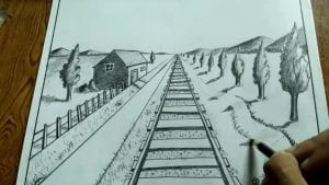
 The second example of creative communication in Carr was the assignment perspective landscape, in this assignment we drew a landscape that has shades and lots of different angles and stuff. Here is an example.

So basically there is a point where everything disappears that is called the breaking point so basically you start off with a do in the middle of the page and that where the end of your road or sunset or water line is.
Here is my example of it.
 As you can see, it is a staircase going down to a hallway and the end of the stairs is where my breaking point is. This helps with creative communication because it gives people a different and more realistic example of anything your trying to explain.
The last example is a cool one as it represents creative communication because it shows my interests and my moral. For example, if it’s confetti colours it means I am fun or if its blue it means cool or, calm. Thanks to the graphic designer who helped us out, Chloe Devine she was a great help to make us understand the method of how you make an original logo. Here is a KWL chart that I wrote about her.
Know, Wonder, Learn – Chloe Devine Edition
Here is my personal brand/logo!
Thanks, CameronBR


