Exhibition season has come and gone once again, arriving like a train barrelling in at full steam, whistle blowing, and departing as silently as a deer in the night.1 Even though the exhibition is now behind us, I still must recap the events of the exhibition, and those weeks leading up to it. Like any train, the exhibition2 needed to start somewhere, and in this case, that would be the beginning of our latest humanities project, Metaphor machines, in which we looked at the causes, symptoms, and goals of revolutions to try and answer the driving question:
How do ideas drive change?
The launch for this project was extremely interesting. It was called Nation X and it was a simulation of a society riddled with problems like class division, food shortages, ever-increasing taxes, a generally dysfunctional monarchy, and much more. All of these factors were pushing the lower classes toward a revolution, but I, along with the rest of the clergy (the highest class), managed to create a semi-functioning society.
We all wrote a reflection of the event, so here’s a link to mine (along with an explanation)
Once we had first-hand experience with what could cause a revolution, we looked at something called a Crane Brinton diagram. It shows the “anatomy” of a revolution, from start to finish, and was created from Crane’s study of famous revolutions.
The four stages of the revolution, according to Crane Brinton’s theory of a revolution are:
1. Incubation: A period of growing discontent and dissatisfaction among the population, characterized by social, economic, or political grievances.
2. Moderate: In this phase, the initial signs of unrest become visible as protests, demonstrations, and strikes start to occur. Dissatisfaction becomes more vocal and organized opposition groups emerge. Moderate leaders attempt to enact reform, advocating for compromise over a complete overhaul.
3. Crisis: A moment of intense upheaval and chaos, often marked by violence, where the existing system is destabilized.
4. Recovery: The establishment of a new order or government, which may bring about positive or negative changes depending on the revolution’s goals.
Here is Crane’s original diagram, and while it is informative, it doesn’t look too amazing.

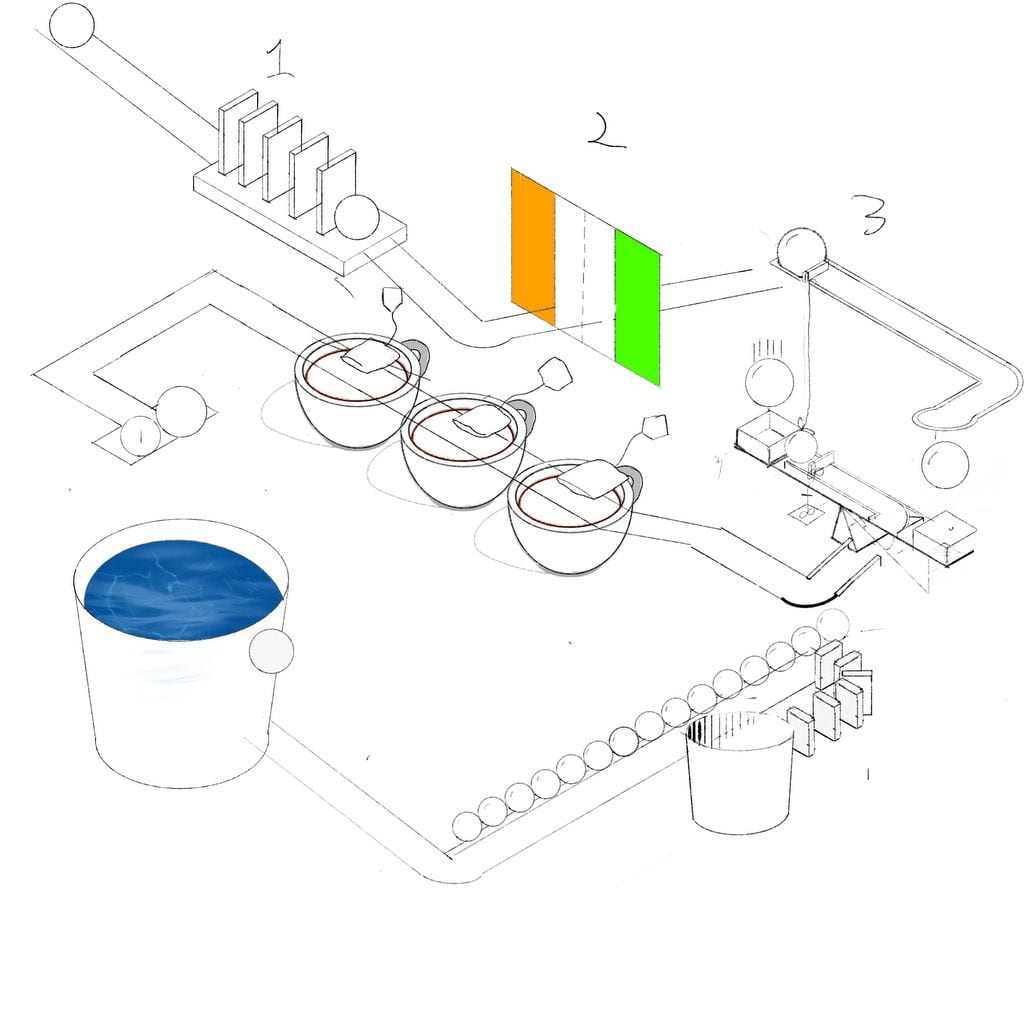
So, we made our own representations of a Crane Brinton diagram 3. For mine, I went with a cake mix as my metaphor, with the ingredients being the incubation factors, the moderate ruler mixing the cake, the crisis stage being the baking of the cake, and finally, the cake is eaten for the recovery stage. I ended up going for a simplistic MS Paint style GIF for my diagram, and I drew it in Procreate.

Now that we had some experience with the structure of a revolution, we were split up into groups based on what revolution we wanted to study for the rest of the project. 4 I got Easter Rising (the Irish rebellion), which was a very short rebellion, lasting a bit less than a week and ending with the rebels surrender, but was one of the first major struggles for Irish independence.
If you would look at the driving question in relation to this rebellion, you could think of the ideas of Home Rule and Irish Independence as the driving force for this rebellion. People didn’t want to be a part of Britain, so they tried to make it happen.
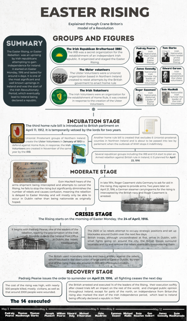
With what we learned about our revolutions, we began to create infographics, showing the events of the revolution in the context of Crane Brinton’s theory. 5
Aside from problems with separating the events into distinct stages, my first infographic had another problem in that it was very “info”, but seriously lacking in the “graphic” department:

In my second version, I made the actual infographic wider and cut down the text I already had 6, which allowed me space to add the graphics. I also broke up the text into subsections and added images relating to those sections. Other additions included a section with important groups and figures in the rebellion and a timeline of the executions of the rebel leaders. After another two or three smaller revisions, this was the final product.

At this time, we were also learning about metaphors. As a part of that, we read the book Animal Farm by George Orwell, which is an allegory 7 for the Russian revolution. While we were reading, we had book chats where we discussed the most recent chapters we had read. These discussions were all unique in some way, and I found it very interesting to try and unravel the connections between the book and the actual Russian revolution, my favorite of which being that Squealer represented the news and propaganda of the time (confirmed by Mr. Harris).

Now, at this point, everyone was (hopefully) very familiar with their revolutions, which meant it was time to start working with our revolution groups on the actual metaphor machine. This machine would, in fact, be a Rube Goldberg Machine. In case you don’t know what that is, a Rube Goldberg machine is a machine that accomplishes a simple task in an unnecessarily overcomplicated way. It is named after American cartoonist Rube Goldberg, who often drew cartoons featuring them.

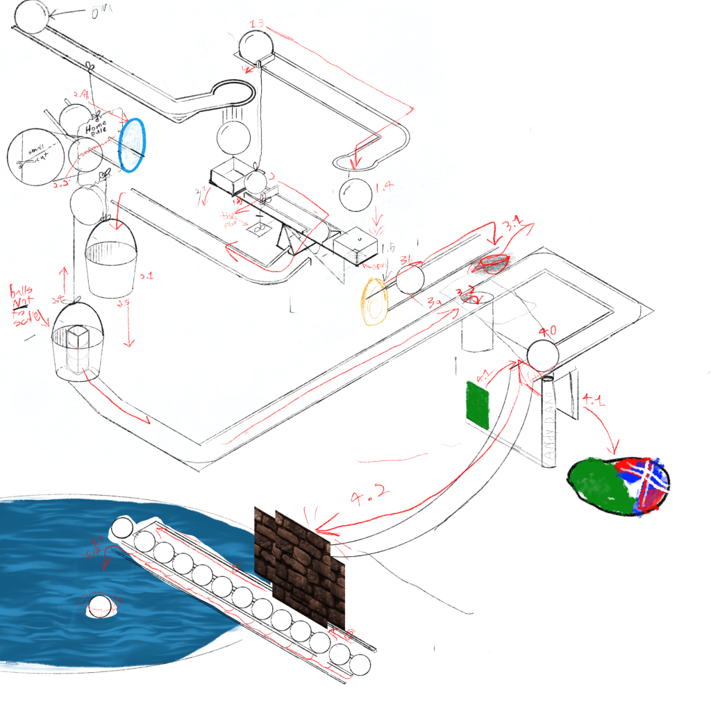
Our machines also had to be metaphors, so every “connection” (A, B, C … in the image) would represent a part of our revolution. So, we met with our revolution groups to plan what our machine would be.
First, everyone individually came up with an idea for a machine, then, we started creating one machine out of different connections from everyone’s machine, and we ended up patching together a full Rube Goldberg machine, metaphors and all. At this point, we only had a sketch of the whole machine, and we were going to have to present our concept to a teacher, so, utilizing the power of open-source software 8, I put together a very janky mockup animation.


After presenting and getting approved, it was finally time to start building the machine. To organize ourselves, we all got roles. My role was Engineer and Physics expert, meaning that my job would be to design the machine and head construction.
To actually build, we first got a parts list together so everyone could start bringing stuff. During the first few days, we didn’t get much done, as we still were figuring out the details of how everything would actually physically work in the real world. After that, we were on a roll. We put our first few connections on a board, which would be mounted on a bookshelf, but almost everything else after that was made individually, which made things easier to build, but would end up causing some problems later with assembly.
While we were building, we were also creating a documentary showing our build process. This did cause people to be away recording a lot, and there were times I didn’t know if we were going to make it, but everything actually turned out, and suddenly, the exhibition was right around the corner.
In hindsight, the build process could have benefited from an actual project management system, rather than just an iMessages group, and the choice to separate all the components was probably a mistake
Once all the plans were in place, we were ready for the final stop on this long and winding train route:
The Exhibition
On the day of the exhibition, we finally got to put it together. As a result of our decision to create everything in parts, this required making a lot of cardboard connectors and improvising, a lot. As the person who had to make sure everything fit and worked, I can confirm it was an absolute headache.
We also had to set up our space with food, drinks and get one of the library computers running a raffle to win a bag of potatoes. This is *more or less* what our space looked like right before the exhibition. Just imagine a pot of potatoes on the table, and way fewer random objects sitting around.

The exhibition itself went fairly well, and even though the machine may have started to break 9, everyone still knew what everything was and what it represented. Our video, while not incredibly flashy, got the point across and overall, I’m proud of how our team did.
Last year, the winter exhibition was from my perspective, a mess. The buildup was extremely stressful, and the aftermath was like that of a tornado ripping through the school. This year’s exhibition felt much more cohesive, at least for the grade 9s. A benefit of us all being in the library was that it really felt like PLP9 was one big team, and that what we were presenting was important, rather than us being scattered around talking about fancy cardboard boxes. I could almost say it was an enjoyable exhibition. 10
This was a long project, or at least it felt like it, and this blog post definitely reflects that. This is technically two blog posts in one, but it’s currently pretty long either way so I’ll end it here.
- Definitely not foreshadowing. ↩
- And this blog post. ↩
- explanatory pictures, animated gifs, digital cardboard boxes, Betty Crocker copyright infringement. ↩
- The specific process was us filling out a google form with our top 3, and then being given a group based on that, Ireland was my #1 so I was pretty happy. ↩
- At this point we had also met with the rest of the people with the same revolution as us, mostly just to discuss the research but the groups would become much more significant soon. ↩
- The final copy actually probably had more text than the first draft, but it covered a bit more, and it was also better organized. ↩
- A an allegory is basically just a really long metaphor, like book length. ↩
- The piece of software in question being the fabulous blender ↩
- It was held together by hot glue, tape, rope, and a healthy dose of hopes and dreams, after the exhibition it was brutally torn apart. We didn’t build for durability. ↩
- If such a thing even exists ↩