Inside The Mind Of Gabi

Wake Up And See The World

Date: March 6, 2015

Our Elizabethan Paired Project

At the beginning of our Elizabethan and Romeo and Juliet unit, we did research on what the Elizabethan era was all about: What food they had, what the housing was like,the types of servants. Everything.

For this research we got into groups of two and got assigned a topic from the era. We had to create a Keynote presentation and present it to our class. I worked with my friend Anatolia for this project and I thought that it turned out really well.

If you want to check out our slides from our presentation, here they are:

As I said above, I think this was a great project, but it could have been improved. Anatolia and I could have practiced a lot more, to get a bit more familiar with the topic and what we were saying. And know for a fact that we both procrastinated on this project, which made it a lot harder to know our scripts and get the project done on time. But I also know that we had fun on this project and it gave me a lot of knowledge about the Elizabethan era and our world history.
The (AMAZING) Periodic Table (Kinda…) Of Dogs!

In science class, we have been studying the Periodic Table and it’s different trends, patterns and sometimes even codes. Then we were told that we had to make our very own Periodic Table of something… well… ANYTHING! So I chose to focus mine on different breeds of dogs! I chose dogs because I love animals and I was interested to learn all this cool information on the animal that I love the most.

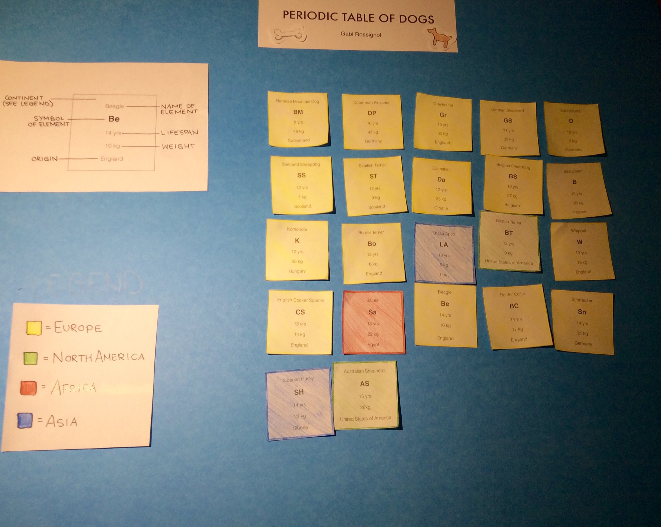
The Periodic Table of Dogs is my interpretation of The Periodic Table of Elements. For this project I created a series of trends and patterns and put them together in a table, of sorts. This blog post is about how to decode the trends and patterns within my Periodic Table of Dogs.

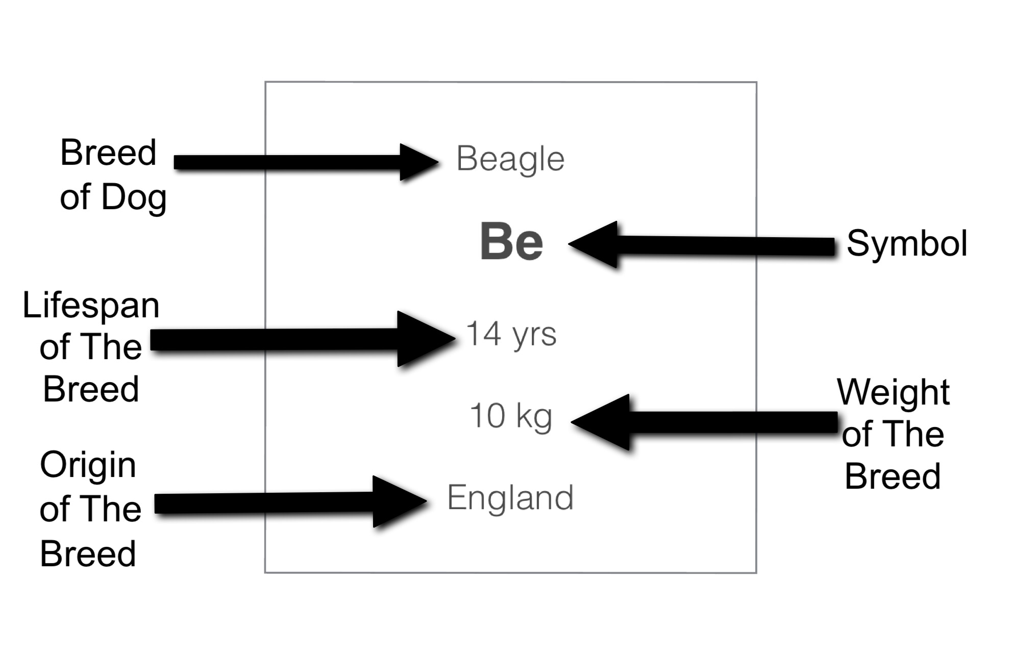
First off this is the example for each separate tile that I have on my project, it probably explains itself better than I could:

The first trend I have in my table is that I colour coded the breeds of dogs to show what continent they come from. The majority where from Europe, two from North America, one from Africa, and one from Asia.

Then I sorted the age spans from youngest to oldest. Being youngest at the top left of the table and oldest at the bottom right. Inside of this trend, I also put them from lightest weight to heaviest weight for each age group.

And that’s pretty much it, not to hard to understand, right?

Skip to toolbar