Hello! This blog post is the summary and story of my latest Maker project. This project is divided in two parts, Carr and Herzog, so this is just the second blog post for this project. I was assigned Carr afterwards which you can tell from this post coming out second. Carr is all about my Apple Pencil and learning to draw. The driving question for this project is why is it important to use technology to further improve our ability to communicate and to think creatively? The reason we are learning this is because communication and creativity will be in almost all jobs by 2025 if not already and PLP wants us to prepare for that. The adult world connection is the understanding that we develop as we do the project, not exactly what we are working on specifically. Drawing helps with communication because you can express your thoughts and feelings in a truly unique manor when drawing.
The first thing we did was learn about all the different tools we have in Sketches Pro, the app we are using. My favourite tool is probably the Pencil. I like it because it looks realistic and its easing to sketch out ideas with without making it permanent. The first day was just used to play around and use the different tools. Come to think of it we also played around with patterns.
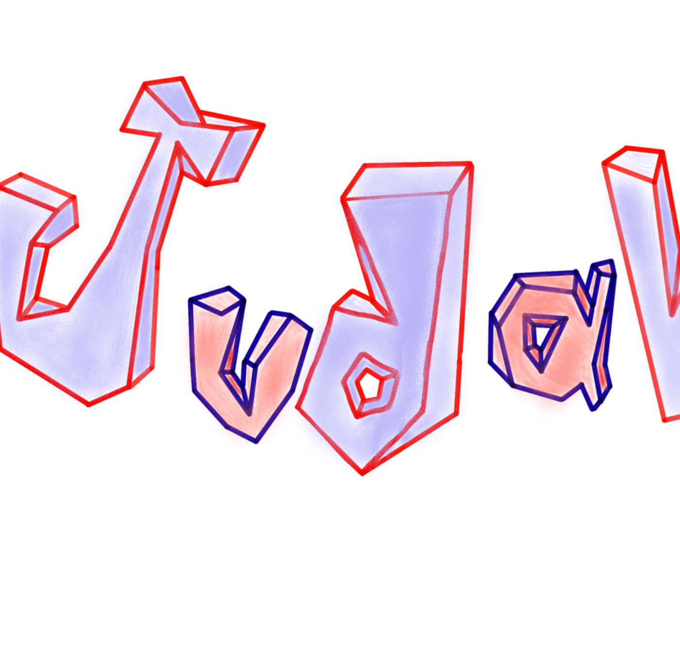
My first sketch reflection I did was with drawing my name. What I learned with this is just because someone gives you some feedback, you don’t have to use it and it’ll still look cool. This ties in with something I’m always working on… perfectionism. I love this to be one hundred percent and perfect, but that’s impossible. As long as you feel its good, that’s enough. Though you should often listen to feedback, it can be quite helpful. The next homework piece we had was sketch notes. If you are like how I was and you have no idea what sketch notes are have no fear, for I am hear to tell you. A sketch note is a drawing with text, containers to organize, arrows and drawings. It is like notes, but a sketch. Pretty simple. Speaking of simple, I learned with this reflection that you don’t always need things to be complicated. For example, the sketch notes! They are simple but they can convey their message so well. The second to last assignment we did was… shading! I was so excited to see this because I really want to get better at it! And I feel I have! What we did for this reflection was we chose an object then it drew it and shaded it the best we could. I chose a D20 (a dice with 20 sides) which was pretty hard to draw. What I learned is that it is okay to spend a lot of time working one something, just not always. But choose carefully what you want to put a lot of effort into. Is it really worth it? This time it was because I had a blast! The final piece we had to do was draw a picture we took. This was to express perspective. I took a picture of my hallway and I think it came out really well, though I believe I could have done a better job with the shading. What I learned was the same thing as the last which was just proving it more. But my next homework assignment I get I won’t put as much thought into (maybe this one? (That’s a joke, teachers)). The final piece I did was my Colour Reflection. I have a lot of thought on it: My logo incorporates four things, my initials, a brain, a star, and a heart. The initials are there to show its me. The brain represents how I’m good at critical thinking. The star shows how i am my one person, one of a kind. And finally the heart represents all my emotions I have. Now that I have told you of all the pieces I drew, lets talk about my favourites snapshots for this project!
In this part of my blog I want to talk about my favourite parts of this project. I think I want to make this a recurring theme for my blogs. Need something to trademark™! My first favourite drawing for this project is… my Shading Reflection, the D20! It has my highest regards. I spent about 4 hours on it and I love it even if others don’t. The second favourite is my Perspective Reflection, my hallway! I spent less time on this one and did most of it in a car. My third favourite is my using Colour Reflection. Logo JG! It definitely isn’t the best but I do like it. I could have shaded it but I didn’t get around to it. I did make the representation for it and here is a mini-paragraph about it: My logo incorporates four things, my initials, a brain, a star, and a heart. The initials are there to show its me. The brain represents how I’m good at critical thinking. The star shows how I am my one person, one of a kind. And finally the heart represents all my emotions I have. Now that’s all my favourites for this project.
All together I believe I did great job on this project and loved the drawing. Not only did I like the general project, but I’m also content with my drawings and work in general.
See ya around and goodbye, Judah G.


