My Advertisements
For this blog post we did this project in Humanities were worked on making an ad for a business. Our group made ads for Patricia Houlihan. In this blog post you’ll see all the drafts and ads I made.
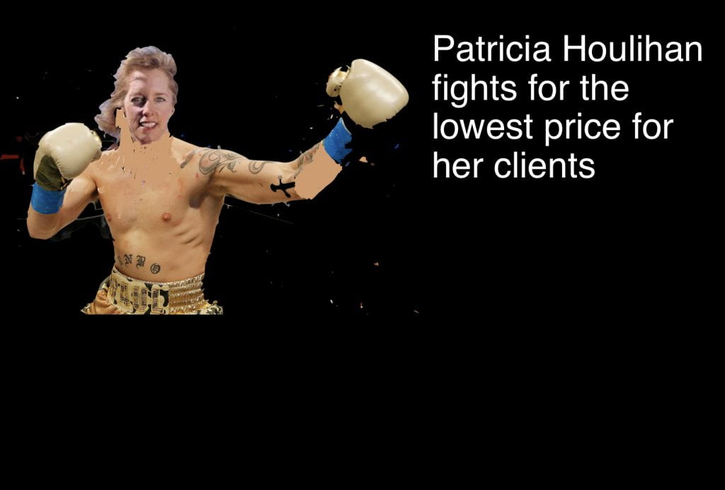
My first ad I made was Patricia’s head on the body of a boxer. How did I make it? I dragged a picture of a boxer of the internet and then a picture of Patricia of the internet I instant alpha’d both of the pictures to fit together. After I did the instant alpha I coloured her skin on her body. All that took me like probably 45 minutes to make this ad it still has a lot of editing to do but here’re is my product so far. Remember this is my first ad I’ve made so far so it isn’t that great. But here it is.
My second ad was a bit better. I made it so it had a good picture with her head on and she wasn’t shirtless. The slogan was Kung fu houlihan fight for her clients at all costs. The slogan was a bit like the other one. But I like the background on this one with the red text I think it goes well together. it also looks good with the picture. My editing on the last ad was really bad so this one is better.

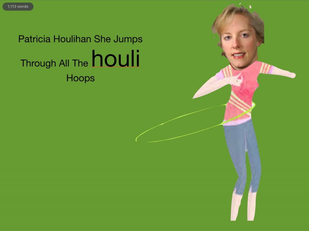
This was my final ad that I made and I end up using this ad for my final ad. The editing isn’t as good as the first one but I like the slogan a lot more. Because it matches her target audience because “she jumps through all the houli hoops” was like a slogan for people in their fifty’s and sixty’s and that’s her target audience. The background looks really bad in my opinion. The green just doesn’t match the image. 
My next ad is the same one just better. I fixed the problem with the editing and made the background better. I put in a new head and new body. I also fixed the text as it wasn’t that good. Meaning it doesn’t look good at all. The text is to small and doesn’t match the houli hoops part. So in the next ad I put in better text and put in a new image and background.

In this ad I put in a new background, image and fixed the text. I put in a new body and in my opinion it looks worse than the other. But the head looks so much better it was just more editable. And the text looks better but not the best still it’s a bit bigger now. In the next ad ill add another background to say she sells houses in the north Vancouver and will put in some better text and edit the image better.
In this ad I put in a way better background and the text looks so much better. So I put in the North Vancouver mountains in the background and raised Patricia’s name to the top of the image. I also made the text white to make it pop out. now all the text is the same size. I Followed her style of ad and made her name black and slogan white. In the next ad ill put in a new picture to make it look better and not chunks out of her body. I’ll also make the text a bit better and blur the background a bit.

In this ad I put in a way better body. The reason why I did the body was because there was chunks taken out of her old body from the instant alpha. I also slightly blurred the background to make everything else the centre of the image. In the next ad it will be just fine edits like text and the background.

In this ad I made the adjusted the text. I made the colour of the text the same as the 2 other ads her name black and slogan white. I also made the text a bit bigger for her name. I made the slogan text white so it would pop more with the background. And that way it wean well with her style of ad that she’s been using so far. In the next ad ill make the text 3D and ill ad her contact information also make the text bigger.

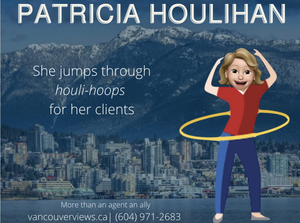
In this ad draft I edited the text a bit and added her contact information. For her name I made it 3D to completely copy her style of ad and I also made houli hoops finer. I also made her name a bit bigger. I added her contact information and her more than an agent an ally slogan as well as her jobs. So that people now what she does. In the next draft ill get rid of some of the text at the bottom and I’ll add a Memoji that I made for her to make her face look more animated this will be my final draft.

In this final draft I made her a Memoji and edited her contact information. For the contact information I made her slogan smaller and got rid of her jobs as well as deleting some of the website. The Memoji I just made from iMessage to make her face look more animated. In this draft it was just feline tunings.
I hope you enjoyed this blog post and in the comment sections say what ad you liked the most.