2 weeks ago we started a new project in our Maker class called, “The Power Of A Pencil.” If you couldn’t guess it was about drawing in different styles and working with the tools we have. There were 5 main techniques we focused on and those were, Word Art, Sketch Noting, Tracing Portraits, Still Life and Logo Design. The driving question for this project was, How Can We Use Our Pencils To Enhance Our Learning? To me this means in what way did I use the technology effectively and to my advantage. Now that we have finished this unit I can answer that question. The biggest way that I felt empowered during this project was when we got to trace ourselves; if you have seen my last post you will know that I am not a very artistic kid but when I got to copy an image straight onto my page I felt like I could finally draw and I surprisingly had fun doing it. Enough with that, lets see my work!
This collage I made is using pictures from the Apple: Everyone Can Create Book.
We started off by writing our names and making them look nice and fancy. I went with a simple but pleasing to the eye option, sticking with only a few colours and a bold name. I decided it was a bit plain so I drew a background that I thought would make sense with them style, I drew bricks. During this section of the project I felt empowered because I had so many options of styles I could choose from, I went with a graffiti style because I’ve always liked it and now that I can simply change the pen I thought it was a great idea.
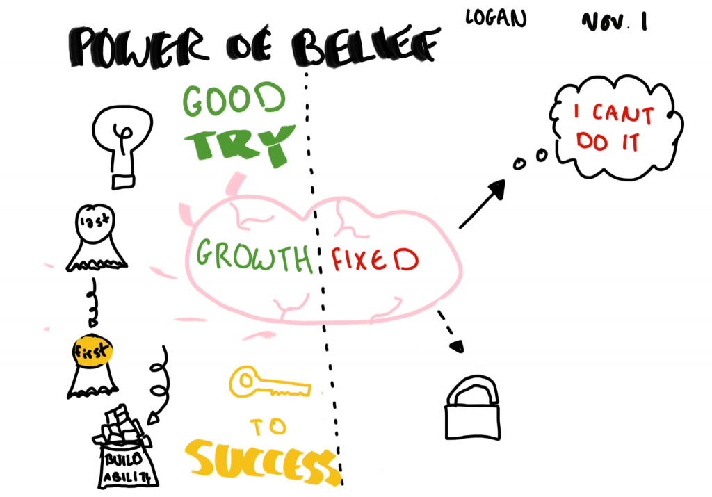
The next task was sketch noting, this was my least favourite. In my eyes, I wouldn’t really call sketch noting art, it’s more like getting ideas down quickly. We were meant to play with the style, size and shape of lettering, symbols that represent ideas and different kinds of connectors such as arrows, dots, roads, etc. We watched a short video called “The Power Of Belief” while watching we were adding to our page with all the things that came up. Personally I’m more of a “just write it all down guy” instead of all the drawings, I think it is unnecessary. I tried using different colours and different sizes of symbols judging by how important they were. I didn’t quite finish but I did the best I could in the amount of time given.
Next up was my favourite task, tracing self portraits. We did this whole part of the project in Sketches Pro. To me this technique out of the five was the most enjoyable, what I figured out during this part was that I have a certain drawing styles but I don’t know exactly what it is. What I see is that I like to stick with base colours and not go into the shading technique, we tried using multiple layers and I didn’t like it as much because it meant you couldn’t fill in larger areas. The part I struggle with the most is definitely the mouth when I’m smiling. I can’t really figure out how to draw teeth properly without making them look scary. Other than that, I thought I was quite good at this particular technique.
The fourth style was shading and using textures to draw a piece of fruit. I tried to be different and draw an apple sliced but I didn’t think it went too well, this piece was probably my worst piece but I was a technique I was willing to try. I tried shading the slices of apple but it didn’t look right so I went for a different approach; instead I used more of a old texture making the apple look somewhat, expired. Although I wouldn’t want to eat this apple it looked intriguing and different. I didn’t really like this style because it didn’t fit me so I kind of adapted and made it a little bit more of me.
The last task was enjoyable, we got to create our own logo. I felt empowered during this because I used so many different apps to make my final product. We had to come up with a company name, a purpose and a tag line. My first draft was a soccer company but I didn’t really like it so I switched. From here I didn’t know if I wanted to do a designer clothing brand, or a car brand, I started veering to the clothing side. The hardest part of this for me was coming up with a good name, I was trying to make it an Italian sounding name because most designer clothing brands are European. I changed the name about five times but after a lot of contemplating I decided to go with “lusso”, it means luxury in Italian. My logo was finished and I was quite proud of it, it was a simple design but I think simpler is better.
That concludes our first Maker project and I really liked some parts but not so much on others. I really think that I improved on a few skills and now I can draw a bit better. I much prefer drawing on iPad instead of paper because it is so much easier to switch the style and use different pens. This ties back in with how I felt empowered, if we did this project on paper I would probably be much less willing to try things and not have a good time but since we had the technology at our fingertips it really helped me persevere and I felt like I could draw at some points. It also made me feel much more creative because there were so many different routes you could have gone down and everybody’s art was different. I learnt a lot about my drawing style during this project and I’m glad I participated.


January 14, 2021 at 11:10 am
how to make a great art like this?