Advertising and advocacy
Currently in school we are learning about advertising and advocacy. So as a challenge we had to make our own advertisements. After each draft we got into small groups of about 5 or 6 and critiqued each other’s ads. We gave one specific comment (something specific that they could improve upon) and one helpful comment (something that you liked about the ad that they could improve even further upon).
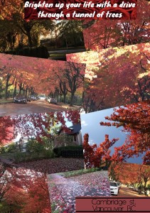
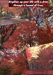
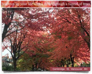
For this ad we had to advertise a certain place to teenagers. I chose Cambridge St in Vancouver BC because it is so beautiful in the fall.
The Tourist ad
You can see how much my ad has changed from draft one to draft three. In draft one most of my feedback was about how I made the ad too crowded with photos.
With this one I got some mixed messages. I still got people commenting on how my ad was too busy. Someone also said that my pictures blended together too much and that I should outline them. So I was at a bit of a loss on what to do.
On the app that I used for post one and two you couldn’t outline photos, so I decided to try a different app. If I could I probably would’ve had more than one photo, but alas (sighs) I could not figure out how to turn the photos. Luckily for me I think it turned out better this way! So yay for that!
The advocacy ad
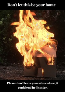
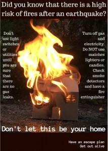
for this ad we had to advocate for a change in people’s behaviour towards earthquake preparedness. As you will read in the paragraph below I misheard the instructions at first and did my ad wrong. So really it had nothing to do with earthquakes. I chose to do my ad about fire because I thought it would be different from the other ads and it would be fun to make.
You’ve probably noticed that draft one is a little different from draft 2 & 3 cough cough sarcasm cough cough. This is because I misunderstood the directions that our teacher gave us. She said “you will be creating an advocacy ad about a disaster”. What I failed to hear was the part about it being related to earthquakes (because that’s what we are/were learning about in science).
My teacher said we had to use our own photos so I thought “do you know what would be fun? I know! How about we set a cardboard house on fire!” Since it took a while to make the cardboard house and then try to figure out how to set it on fire in the rain I decided that I wasn’t about to just throw all my hard work out the window and start from scratch. So I researched a bit further, and turns out that fires and earthquakes are actually related!
For draft three I rearranged the text so it lined the photo like a picture frame. I made the paragraph that was at the bottom into four different sections. The right and left columns, I separated “did you know that there is a high risk of fires after an earthquake” and put it at the top and I put “have an escape plan, get out alive” in the bottom corner. I also put “Don’t let this be your home” near the bottom.
The Business ad
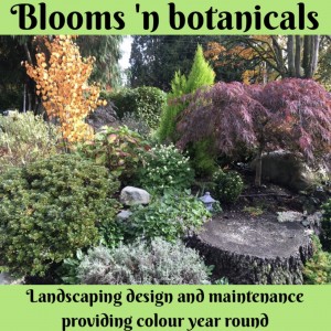
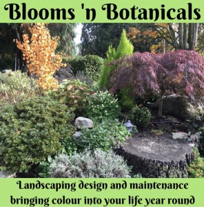
for this ad we had to advertise a certain business. We had to know the owner or someone who was close with the owner. I chose Blooms ‘n Botanicals because my mom’s friend created the business.
To make draft one I took pictures of my garden from different angles. While I was taking the pictures I had to try to keep my house out of the background because I wanted the focus on the garden.
I didn’t change much between draft one and draft two. I just reworded the bottom part. Most of the feedback that I got for this one was about the green colour that I put my text on. They said to make it more green and to make it brighter.
One of the comments on my second draft was that there was too much green. So I decided to colour the bottom half of the picture gray. Then I put a paintbrush on the ad to make a point that the company brings colour to your garden. For this ad I was going to change the green but I decided to edit the photo first and then once I edited the photo the text showed up on it. The only reason that I had the green in the first place was because you couldn’t see the text if it was on top of the photo. Once I edited the photo though, you could see it easier. I’m probably going to outline the text so you can read it easier.
