For our last unit in math class before the Christmas break, we looked at a mathematical theory/ phenomenon called the Golden Ratio.
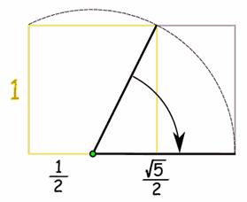
Like me, you’ve probably never heard of it. Well, let me tell you. It is a design that has a rectangle outside, and on the inside, smaller squares that repeat in an endless spiral. Here is a picture of one on its own:
Now, what’s special, is that this rectangle has a special ratio for its side lengths. The ratio is 1 : 1.61803…
The second number, 1.61803 goes on forever, and is similar to the more popular number Pi. The ratio means that on the rectangle, and measurement on the short side will be a multiple of 1, and the measurement on the longer side will be a multiple of 1.61. These two sides will always have that ratio, otherwise it’s not the golden ratio.
For example, if the side length is 2 on the short side, the longer side will have a length of 3.23, and so on.
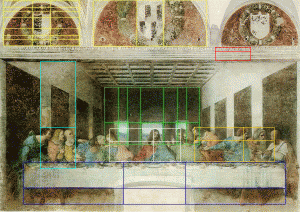
The golden ratio has been used by many famous artists, like Da Vinci in his famous The Last Supper painting:
Its also been used in lots of architecture, like the well known landmark The Parthenon, in Rome:
The reason it is used in these places is because it is believed that it is aesthetically pleasing to our human eye. And so, this became our project. We needed to design and create a work of art that showcased multiple golden ratios. It could be anything from a poster, to Music, and to drawings.
After some thought and research, I decided to draw my own picture, even if I’m not really artistically gifted.
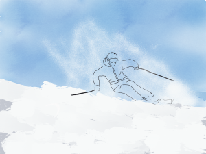
The first step was to research the golden ratio more, and find my inspiration for my drawing. It took me a while to choose an idea, and I went through several different sketches. I finally settled on a skier coming down a mountain. To draw my thoughts and ideas, I used an app called Sketches Pro, which I grew to like. A great feature is that this app lets you draw on many different layers, so your different objects you draw don’t interfere with each other. This helps it stay neat. At first I didn’t know about this feature, and got stuck once my drawing looked like this:
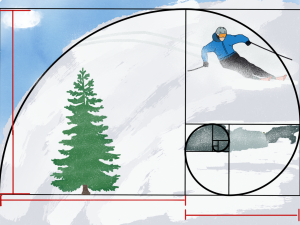
But then, I re-started and it was a lot better. I traced my skier onto the canvas, and then added my backgrounds and things around him. I then finished, and after looking at how I could bring everything together, I put each thing in specific places to fit with the golden ratio. This is my drawing before I overlayed the golden ratio diagram:
And this is after:
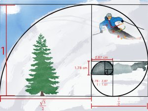
But I still needed more golden ratios. I then used the rock drop in the snow to be the central object that the golden spiral loops around on. I used this technique, moving my objects around, to help me find more golden ratios in my drawing, and came up with this as my final project:
For each golden ratio, I used a different labeling method. For the big one over the whole image, I used a fraction method that works for any numbers that fit the golden ratio proportions:
For the skiers arm, I used an algebraic method that shows the ratio of the sides of the rectangle and how they work together to make a golden ratio. This also shows how you can replace those letters with numbers, and it will help you add them together easier:
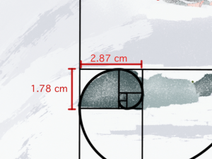
And for the rock in the center, which, believe it or not is its own golden ratio, I marked it with the actual measurements I got from measuring the rock on my ipad screen. If you divide 2.87 by 1.78, you get 1.61, which is the golden ratio. I also like having the second golden ratio under the big one, because it shows how the golden ratio repeats itself infinitely.
Well, that sums up this unit and project. At first, I didn’t think this project was going to be fun. I had no idea what the golden ratio was at first, and didn’t know how to apply it to art. But then once I researched and got going, I felt more prepared. I actually really enjoyed the drawing part of the project, since I love skiing and I liked using the app. Overall, I had fun during this project, and learned a lot more about ratios, even the golden one.
See you

